The Illustrator Studio: Art Direction Built Into AI Image Generation
The Illustrator Studio
A close look at what it takes to get a genuinely good image out of an AI model when you have never learned to write a prompt, and why the answer turned out to be art direction rather than better prompting.
Most AI image tools start you in the same place: an empty prompt box and a blinking cursor. The box looks simple, but it carries a quiet assumption, that you already know how to describe an image the way a model needs to hear it.
The people who get striking results from these tools have usually spent months learning the vocabulary, the lighting terms, the composition cues, the small phrases that push a model toward one look instead of another. Everyone else types a sentence, gets something flat and oddly generic, and quietly concludes that this is just what AI images look like.
The Illustrator Studio starts from a different premise. Getting the right image in the right style should be easy, even if you have never written a prompt in your life. The skill belongs in the tool rather than the user.
The Prompt Architecture
This is the decision that shapes everything else. Instead of handing you a blank box, The Illustrator Studio builds each request from three layers: the visual style you select, an optional composition mode, and your own subject or text written in plain language. The system assembles the rest of the prompt for you, the part that decides how the image should feel, how it should be arranged, what visual language it should use, and whether you are describing a scene or asking for exact words to be rendered.
The effect is that an ordinary sentence becomes an expert-level prompt before it ever reaches the model. You bring the idea. The studio brings the craft. What comes back is artwork with a clear creative direction rather than the interchangeable look that makes so much AI imagery instantly recognizable.
Curated Styles as Creative Systems
A style here is far more than a single keyword tacked onto a prompt. Each one is a reusable creative system that carries its own lighting, material, mood, typography, and layout guidance. Choosing a style is closer to hiring an art director with a strong point of view than to flipping a filter.
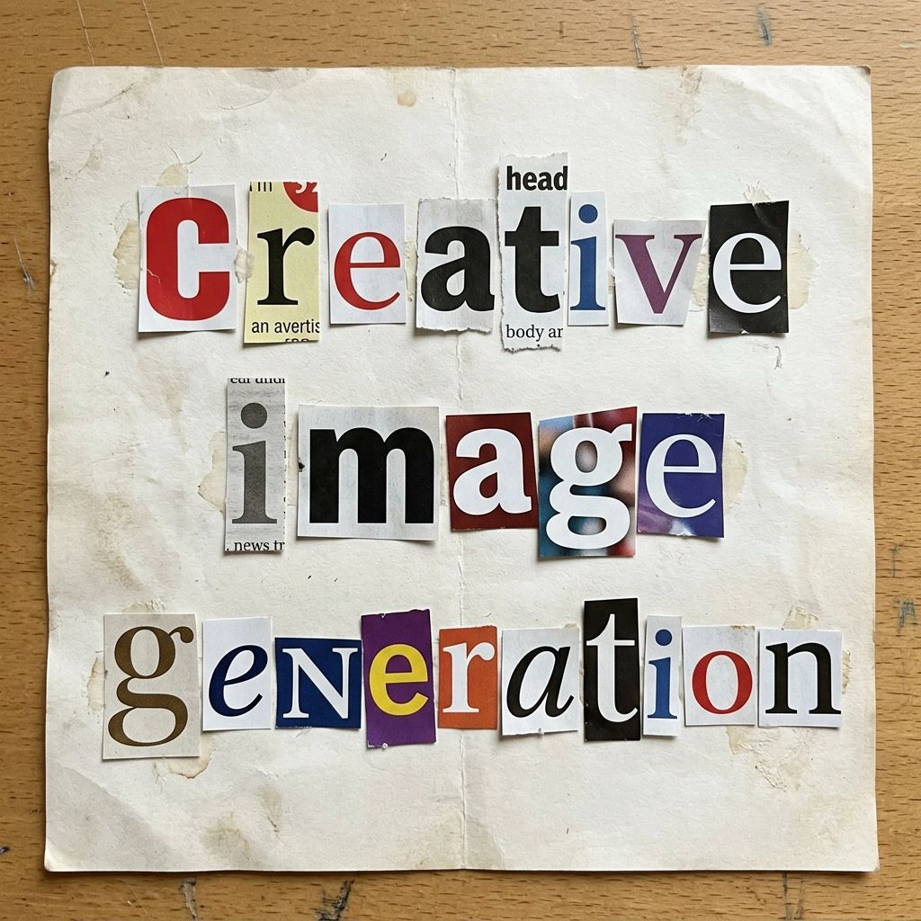
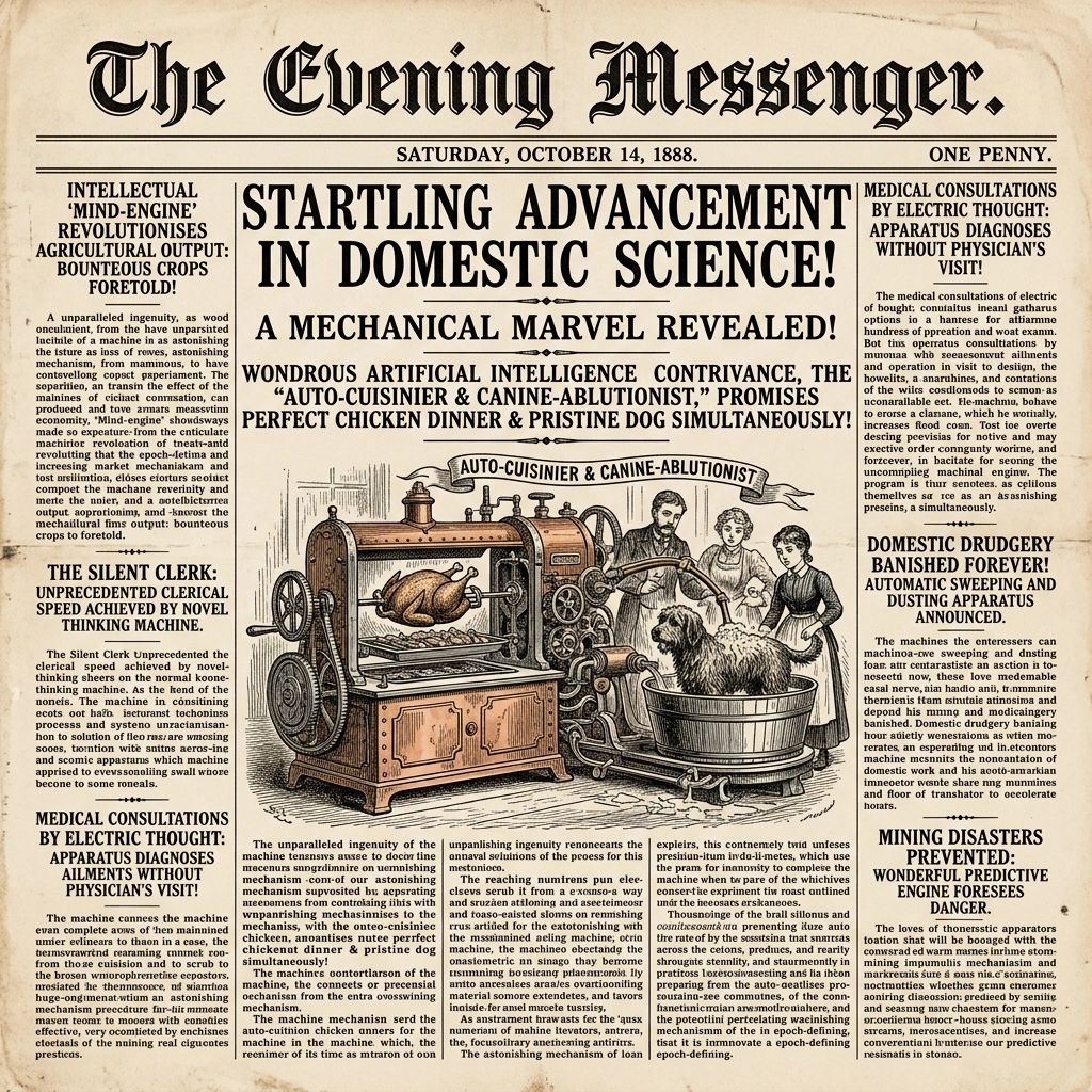
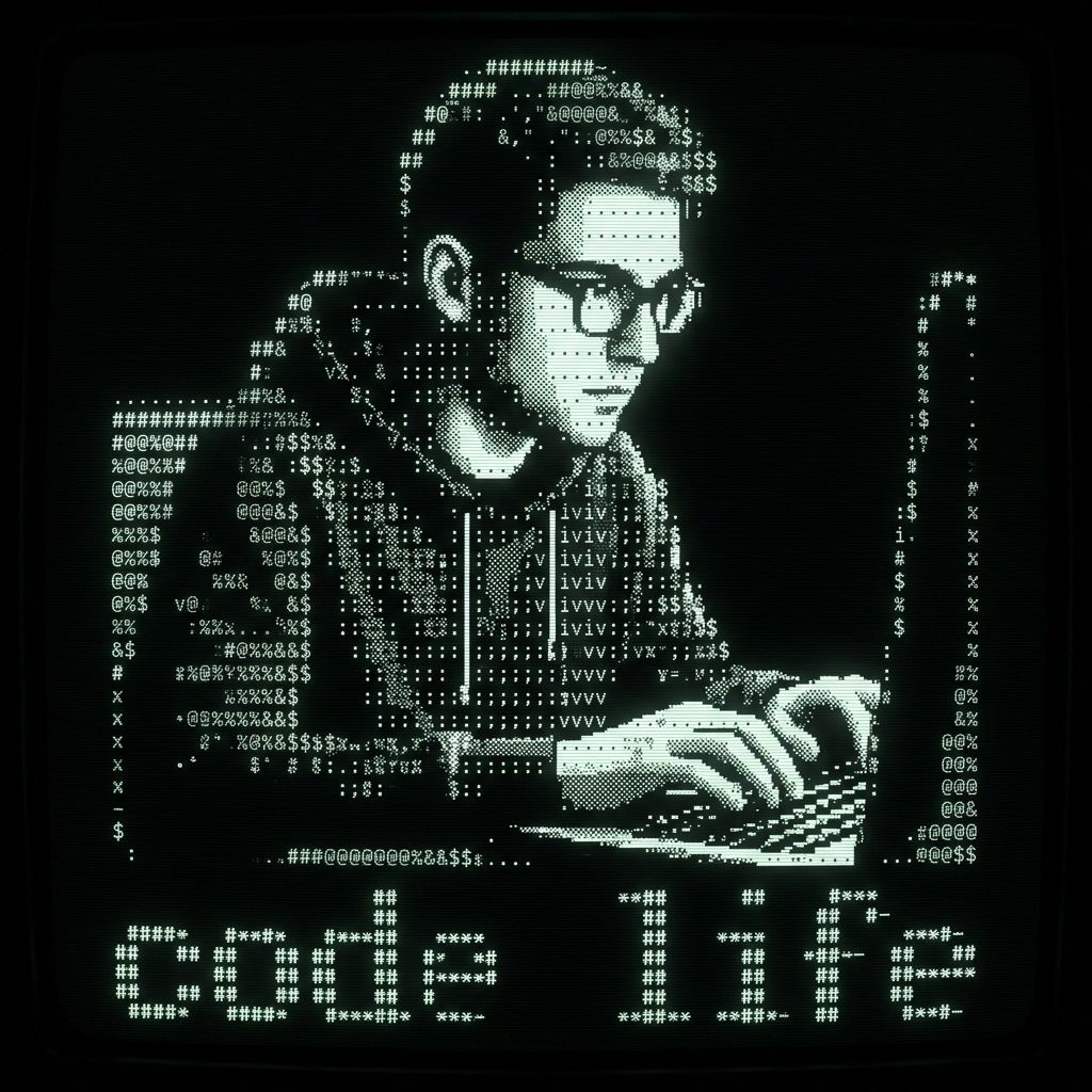
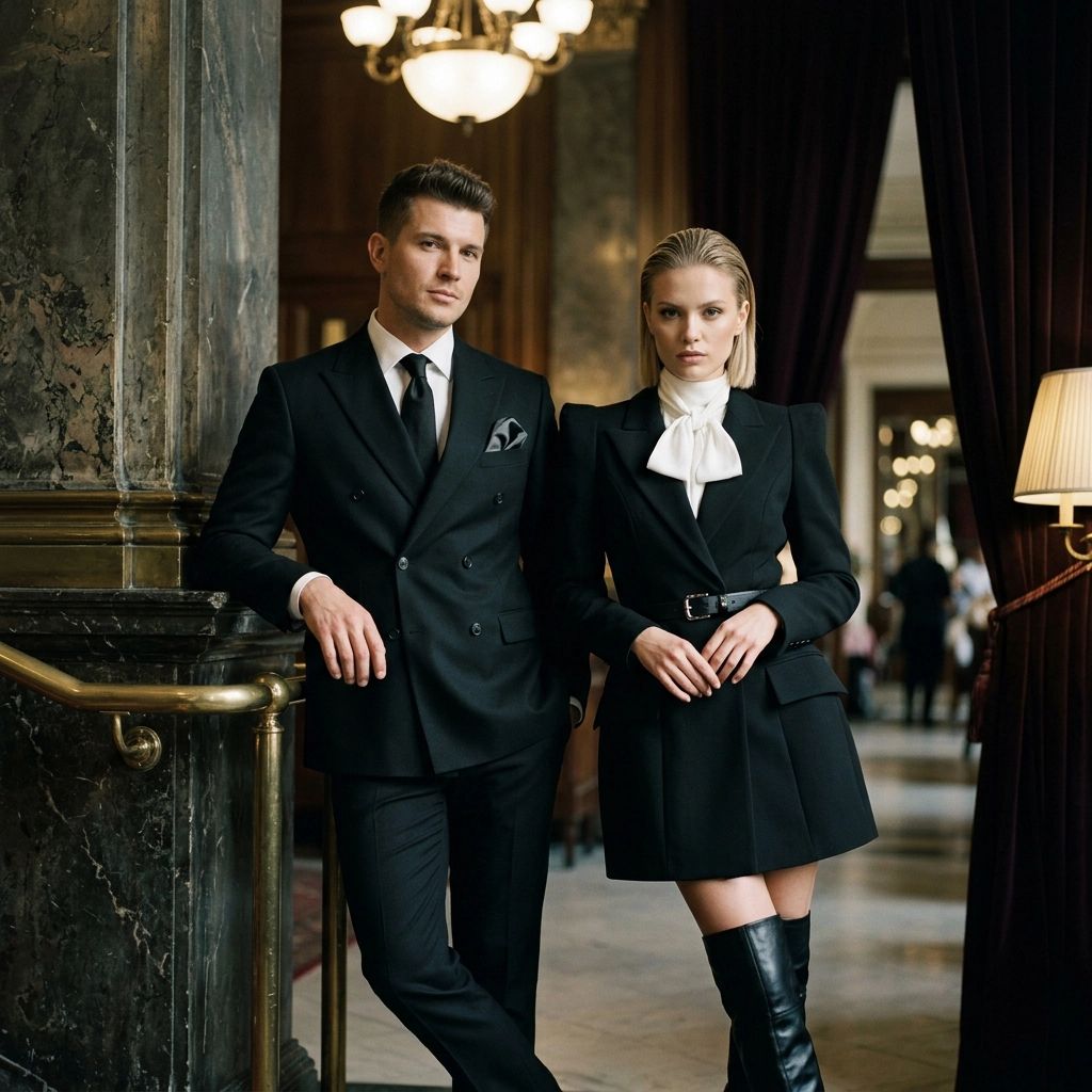
The library runs to well over a hundred styles, and the range is intentional. There are fine-art movements like Impressionist plein air, Cubist, Art Nouveau, and Bauhaus poster. There are photographic processes like daguerreotype, cyanotype, and wet plate collodion. There are typographic treatments like welded metal letters, torn paper text, neon sign, and gold-leaf lettering. There are technical looks like precision blueprint, macro circuit, and medical anatomical plate, alongside contemporary aesthetics like vaporwave and neon synthwave. Every one of them steers the result toward a specific direction, which is what keeps the output from sliding into the default AI sameness.
Composition Modes
The second layer is structure, and it is optional. A composition mode decides how the idea is arranged on the canvas, which is usually the part a non-designer has the hardest time describing. The modes include centered isolation, educational diagram, exploded assembly, cross-section cutaway, comparative layout, sequential panels, environmental scene, and technical schematic.
If you want a clean product shot, centered isolation handles it. If you are explaining how something works, the educational diagram or exploded assembly mode does the arranging for you. You describe what the thing is, and the mode takes care of how it sits in the frame.
Typography That Renders Correctly
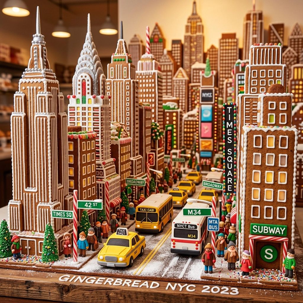
Rendered text is the thing AI image tools are notorious for getting wrong, with letters that warp, misspell, and collapse into nonsense. The Illustrator Studio handles this with a dedicated path. When you select a typography style, the prompt field changes to exact text input, so the model is given the precise words to render rather than left to guess at spelling, capitalization, and spacing.
That small change is what makes the typographic styles usable for real work. Welded metal letters, torn paper text, neon sign, gold-leaf lettering, chalkboard menu, and the rest all depend on the words coming out correct, and routing typography through exact text input is what keeps them reliable.
Multiple Models, One Workflow
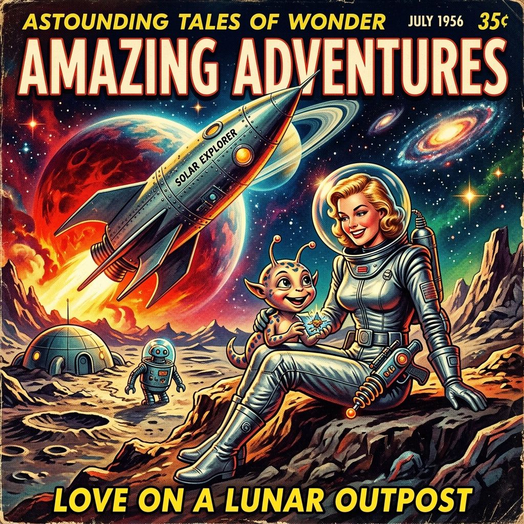
Different image models are good at different things, so the studio supports more than one provider and keeps each model's specific settings organized inside a single consistent interface. You can match the model to the look you are after without leaving the workflow or learning a new set of controls for each one.
In practice that means you pick a model, adjust the controls that belong to it, and generate, all in the same place. The complexity of juggling providers stays under the surface where it belongs.
How It Works
The whole experience comes down to four steps, and only one of them asks you to write anything.
First, choose the look. Start with a visual style such as cinematic studio, storybook watercolor, technical schematic, or welded metal letters. Each one gives the output a point of view.
Second, choose the structure, if you want it. Add a composition mode to dictate how the idea is arranged, or skip it and let the style decide.
Third, write the content. For most styles you simply describe the image in plain language. For typography styles you enter the exact words to render. There is no prompt syntax to learn either way.
Fourth, generate and refine. Pick a model, generate, compare results, expand an image for a closer look, then download the strongest version.

Production-Minded Output
A creative tool is only useful if the output can leave the tool. Generated images can be inspected, expanded, opened at full resolution, and downloaded immediately for portfolio or presentation work. The goal was always artwork you can move directly into a real project, not a gallery you can only look at.
Responsible Generation
Exposing an image model on a public page is a real risk if you do it carelessly, both for abuse and for runaway cost. The studio guards the endpoint with reCAPTCHA verification before any model call is made, so the tool can stay open for anyone to try while staying safe to expose. It is a quiet piece of the build, and it is the kind of detail that separates a demo from something you can actually leave running.
Built Into Lumi Forge
The Illustrator Studio is part of Lumi Forge, where books, articles, newsletters, courses, and learning resources are turned into interactive experiences. It exists because creators kept needing custom illustration and did not want to bolt on a separate production workflow to get it.
So it is built for exactly that: book visuals, resource artwork, article graphics, and companion learning materials, all created with clear art direction instead of prompt-engineering guesswork. You generate options, compare them, inspect the strongest one, and move it straight into a Lumi Forge resource or a related creative asset. It reflects the larger Lumi Forge goal of helping ideas feel more alive through visual clarity, curiosity, and accessible creative tools.

What This Project Shows
For collaborators and employers, this project is meant to show more than a form wrapped around an API. The model call is the easy part. The work is everything around it: the product architecture that turns three layers into one expert prompt, the prompt-system design behind the curated styles and modes, the responsive UI engineering, the multi-provider integration, the secure server handling that protects a public endpoint, and the visual judgment needed to decide what a good result even looks like.
Put together, those are the pieces that turn raw AI capability into a creative tool a real person can pick up and use well on the first try.
What Makes This Different
The difference comes from the combination. Curated art direction gives the output a point of view. Composition modes handle the part most people cannot describe. Plain-language input removes the prompt-writing barrier. Exact text input fixes the typography problem. Multiple models let you match the tool to the look. None of these on its own would be remarkable. Together they let someone who has never written a prompt produce art-directed images that hold up in real work.
That is the whole idea behind The Illustrator Studio: lower the barrier without lowering the ceiling.
Quick Reference: How to Use It
Choose a style first, since it sets the entire creative direction. If you have a clear sense of how the image should be arranged, add a composition mode. If not, leave it off and let the style carry the composition.
Describe the image in plain language. For a typography style, type the exact words you want rendered instead of describing them. There is no special syntax to memorize in either case.
Pick a model, generate, and compare what comes back. Expand the strongest result to inspect it closely, download it at full resolution, and move it straight into your resource, article, or presentation.