Building Scroll-Linked Particle Stories with Three.js and React
TLDR;
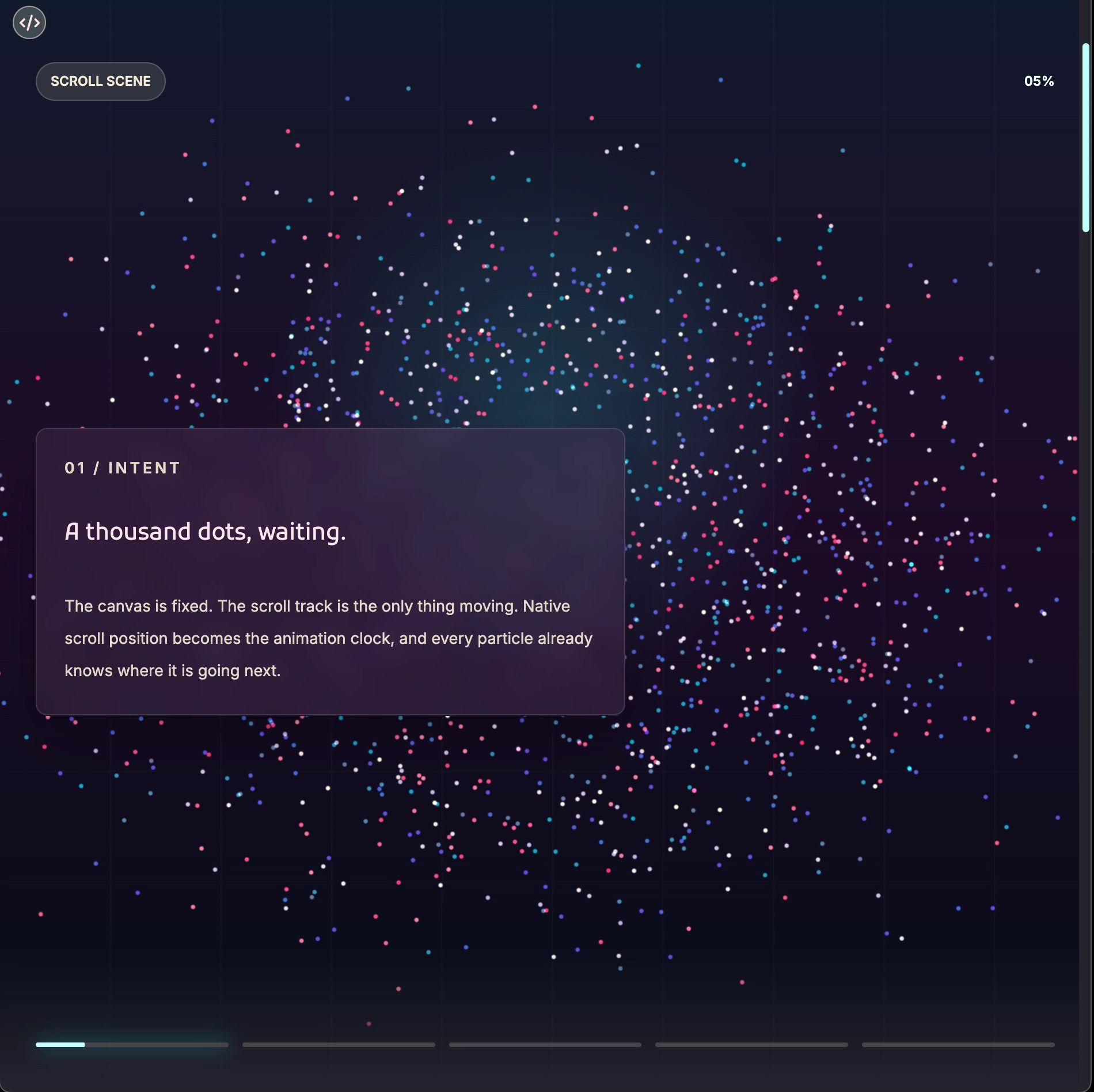
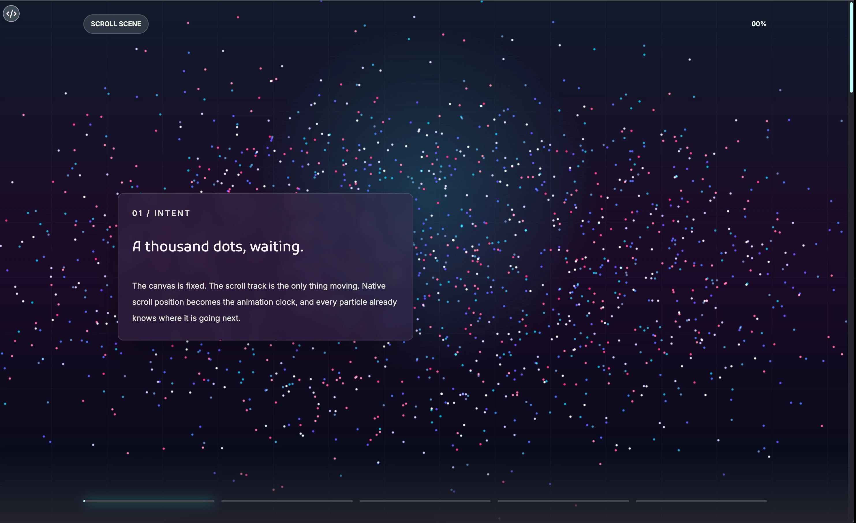
The Particle Scene That Runs on Scroll
A deep look at ParticleScroll: what it does, why it works, and how a thousand glowing dots became a storytelling engine.
There is a moment, right around the time you start caring about your users as much as your code, when you realize that the way something moves matters just as much as whether it works at all. Animation is usually where that realization hits hardest. Most UI animation is an afterthought tacked onto the end of a sprint. But every now and then someone builds something where the motion is the point, and the rest of the UI is just there to give it context.
ParticleScroll is that kind of thing. It is a full-screen scroll storytelling component built on Three.js that ties a WebGL particle scene directly to the browser's native scroll position. As you move down the page, the particles morph. Content panels fade in and out. Progress indicators fill. The whole thing feels alive in a way that CSS transitions rarely do. And the developer experience, which is usually where ambitious visual components fall apart, is surprisingly clean.
Let's dig into it.
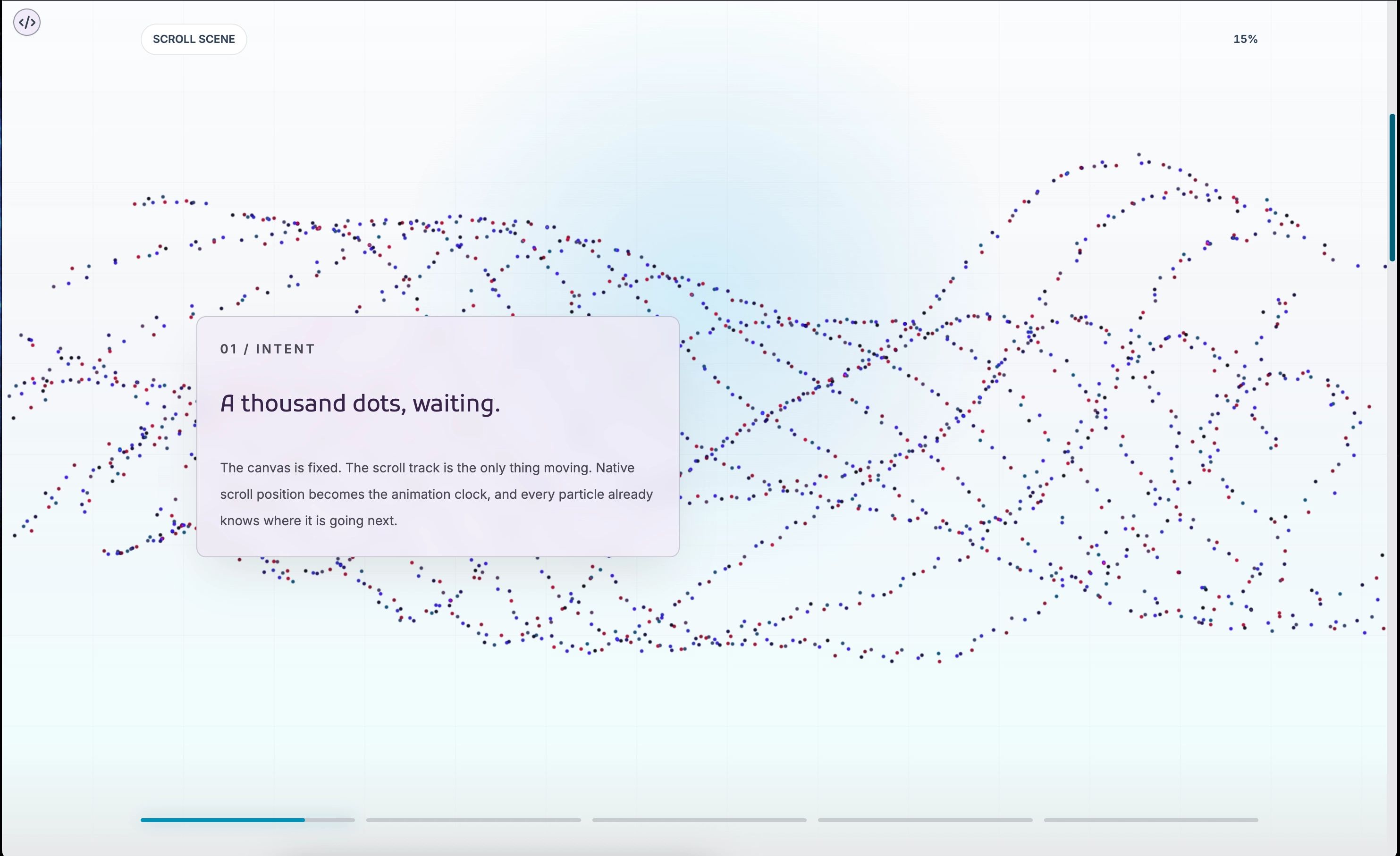
The Core Idea (And Why It Is Elegant)
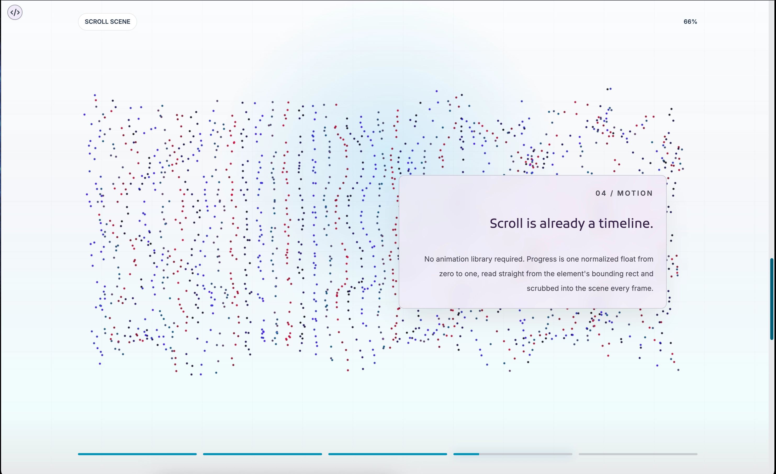
The architecture is built around a simple insight: scroll position is already a perfectly good timeline. You do not need a scroll animation library or a GSAP plugin or a custom RAF loop wired to some scroll velocity calculation. You need a normalized number from 0 to 1, and the browser hands you that number for free via the element's bounding rect.
ParticleScroll sets up an outer wrapper div that acts as the scroll track. It is an invisible rectangle that occupies real document height, defaulting to 500svh. The visible scene, the canvas, the content panels, the progress strip, all of it, lives inside a position: fixed viewport div. The scroll track moves; the viewport stays put. Native scroll behavior, browser history, momentum scrolling on iOS, all of it works exactly as expected because the component never touches any of it.
The progress calculation is about four lines:
const rect = scroller.getBoundingClientRect();
const scrollableDistance = scroller.offsetHeight - window.innerHeight;
targetProgressRef.current = clamp(-rect.top / scrollableDistance);
That number, a float from 0 to 1, drives everything else: which particle frame to interpolate toward, which content moment to show, how far to fill the progress indicators. The rest of the component is just reading from that single source of truth.
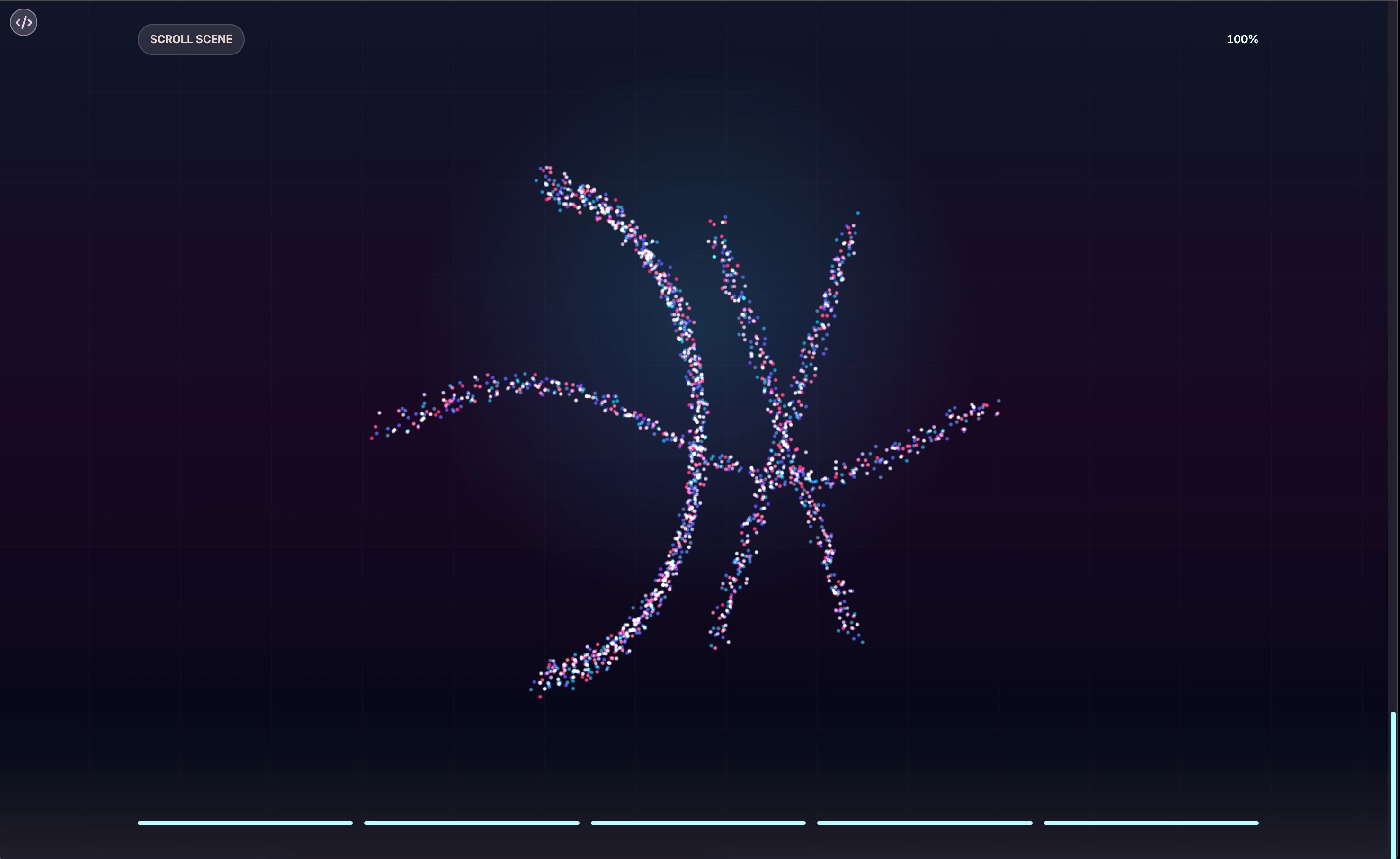
The Particle Engine
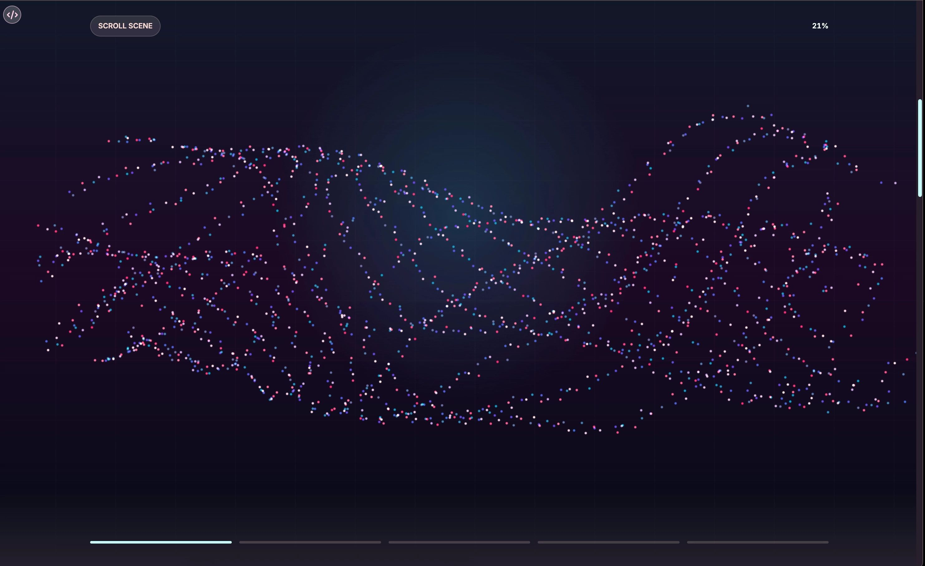
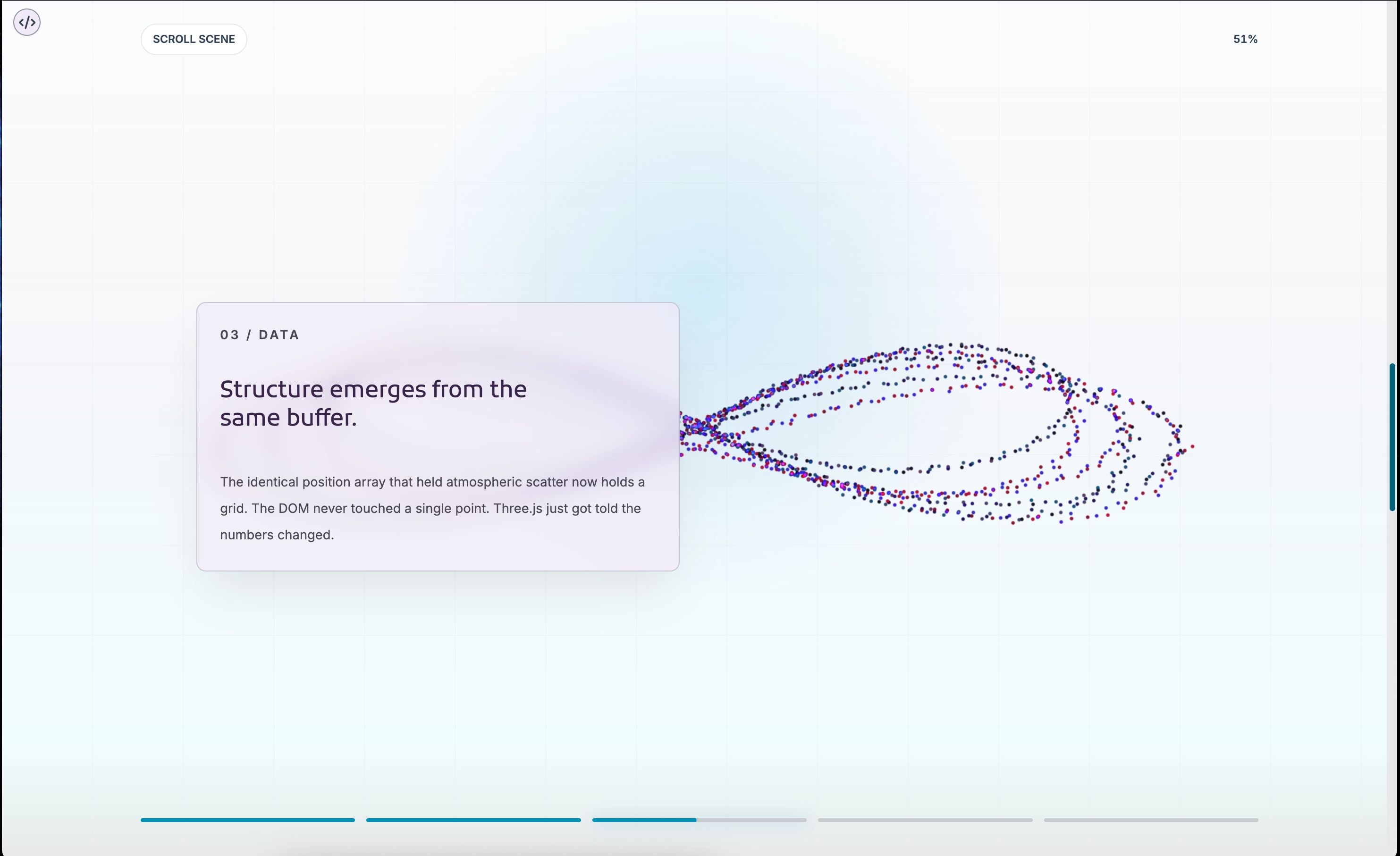
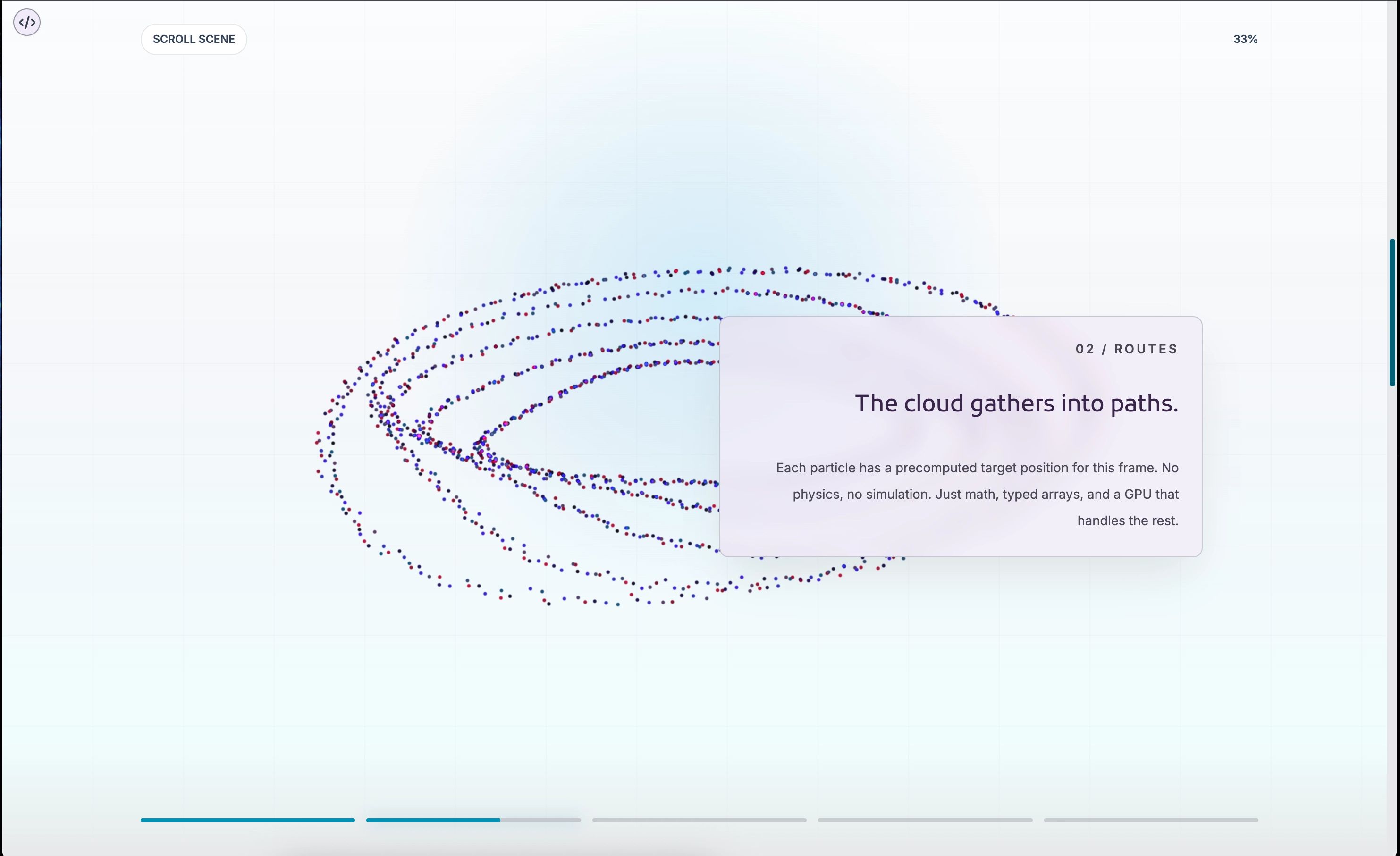
The actual WebGL side of things is where it gets interesting. Each particle is a point in a Three.js BufferGeometry, stored as a flat Float32Array. The component precomputes a set of "frames," each of which is a snapshot of where every particle should sit for a given shape. During the animation loop, it interpolates between the current frame and the next one based on the scroll progress, writing new positions directly into the geometry buffer each tick.
This is a smart approach. There is no per-particle state object, no React re-renders driving the motion, no DOM updates happening 60 times a second. Just typed array math and a single geometry.attributes.position.needsUpdate = true call to tell Three.js something changed. The GPU handles the rest.
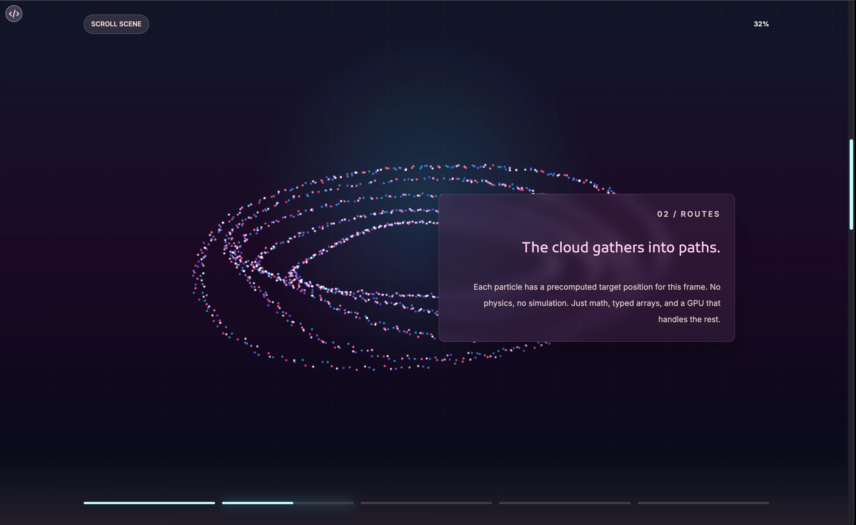
The default shape sequence moves through five forms: an ambient cloud, a route-like structure of branching paths, a data grid arrangement, an orbital ring pattern, and a final mark formation. Each one is a pure function that takes a ShapeContext (count, visible width, height, depth) and returns a Float32Array of positions. Adding a new shape is as simple as writing a new function and dropping it into the createParticleFrames array.
There is also a wobble system that kicks in when scrolling stops. The particles breathe a little, drifting in a sine-wave pattern using a seeded random offset per particle so they do not all move in lockstep. It keeps the scene from feeling frozen during those moments when a user pauses to read. Small detail, real impact.
The Developer Experience
Here is where a lot of ambitious visual components drop the ball. The effect looks great in the demo, and then you go to actually use it and find yourself buried in configuration, fighting with z-indexes, or discovering that it assumes a page structure you do not have. Not this one.
The simplest possible usage is one prop:
<ParticleScroll moments={moments} />If you omit moments entirely, the component runs a built-in demo sequence so you can see what it does immediately, without writing a single data object. That is a nice touch. It means you can drop it into a page, see the full experience, and then start shaping it toward your actual content.
The moments array is the primary API surface. Each moment is a plain object with an id, a normalized range from 0 to 1, and then whatever content fields you need. The simplest moments use eyebrow, title, and body for a structured text panel. When you need something more custom, you pass a content prop with any React node and the default panel renderer steps aside.
const moments: ParticleScrollMoment[] = [
  {
    id: "intro",
    range: [0, 0.2],
    align: "left",
    eyebrow: "01 / Welcome",
    title: "Your story starts here.",
    body: "Particles set the mood while you say what matters.",
  },
  {
    id: "custom",
    range: [0.4, 0.65],
    content: (
      <div>
        <h2>Anything goes in here.</h2>
        <p>Custom layouts, images, interactive elements, all of it.</p>
      </div>
    ),
  },
];
What makes this API feel considered is that the content layer and the particle layer are genuinely independent. You can customize the particles without touching the content, and vice versa. The two halves communicate only through the progress value, which neither of them owns.
ParticleScrollContent. The backdrop blur and border opacity are tuned to stay readable against both bright and dark particle arrangements.Light Mode, Dark Mode, and Everything In Between
Most WebGL components in the wild are dark mode components with a light mode toggle that vaguely works. ParticleScroll has full separate palettes for both themes, and they are not just color swaps. The dark palette leans into deep blues and purples with cyan highlights, radial glows, and high-contrast particle colors. The light palette shifts to slate and sky tones with softer backgrounds and more restrained particle colors that still read clearly on pale surfaces.
The palette system is genuinely granular. You get control over the background gradient, the grid overlay, the bottom fade, particle colors, the scene label, progress text, indicator track, indicator fill, and the active indicator glow. You can override one field or all of them:
<ParticleScroll
  darkPalette={{
    particleColors: ["#9f24d4", "#9a50ba", "#00949e", "#f8e0ff"],
  }}
  lightPalette={{
    particleColors: ["#7c3aed", "#be185d", "#0891b2", "#1f2937"],
    backgroundClassName: "bg-white",
  }}
/>
Because particle colors are assigned per-point using a seeded random index into the color array, changing four hex values produces a completely different visual character across the entire scene. It is one of those small levers that has an outsized effect on the outcome.
The Progress Strip
At the bottom of the viewport sits a row of thin progress bars, one per moment, that fill as scroll moves through each moment's range. The active one gets a soft glow. It is a small affordance, but it does something important: it tells the user that there is more to see, and it tells them roughly where they are in the story. Without it, a scroll-linked experience can feel like a room with no visible exits.
The number of segments is automatic. Pass five moments, get five bars. Pass two, get two. You can hide the strip entirely, hide just the percentage readout, or restyle the container with progressClassName if you want different spacing or padding. The component makes a reasonable default choice and then gets out of your way.
activeIndicatorClassName. The percentage label is visible in the top-right corner.Shapes As Pure Functions
This is the part I keep coming back to, because it is a small architectural decision that has a big creative payoff. Each particle shape is a function. It takes a context object describing the visible scene dimensions and particle count, and it returns a Float32Array of positions. That is the entire contract.
The built-in shapes cover an ambient cloud, branching routes, a data grid, an orbital ring, and a mark formation. But because each shape is just a function, extending the system requires no special knowledge of the internals. You write your math, you drop the function into the createParticleFrames array, and it becomes part of the sequence.
The README includes a worked example of a heart shape using the parametric heart curve. Here is the key bit: because particles are interpolated between frames, not teleported, that heart shape will emerge smoothly from whatever precedes it. You could build a sequence that moves from a circle to a logo mark to a data grid to a heartbeat line, and each transition would be a fluid morph. The interpolation system does not know or care what the shapes represent. It just moves points toward their targets at a rate controlled by the TARGET_EASE constant (currently 0.08, which gives a nice lag that makes fast scrolling feel organic).
Custom Rendering When You Need Full Control
The default content system handles the most common cases well, but sometimes you want to position and render content in a way that the default panel does not support. Maybe you need multiple panels simultaneously, or a full-bleed layout that ignores the built-in constraints. The renderMoment prop handles that:
<ParticleScroll
  moments={moments}
  renderMoment={(moment, context) => (
    <div key={moment.id} style={context.style}>
      {moment.content}
    </div>
  )}
/>
The context object gives you progress (the full scene progress), opacity (the computed opacity for that moment), and style (the default opacity, transform, and pointer-events object you can spread or ignore). You own the output. The component just tells you what state things are in.
That is good API design. The component does not try to predict every layout you might want. It exposes the data and steps back.
Performance Considerations
A WebGL canvas running a scroll-linked animation loop is not free. There are real tradeoffs here, and the component is honest about them. The defaults sit at 1,900 particles, a point size of 9, and opacity of 0.92. These are tuned to look rich without destroying mobile GPUs. Push to 4,000 particles and you will start to feel it on mid-range phones.
A few things the component does to stay reasonable. The pixel ratio is capped at 1.75, so retina displays do not render at 3x or 4x. The entire scene visibility is gated on an isSceneActive check based on whether the scroll track is in view, so if you embed the component mid-page, it stops animating when the user scrolls past it. The scene recomputes its shape frames on resize so particles always fill the visible area correctly. And the wobble system is throttled with a delay and a fade so it is not constantly running at full strength.
For lower-end targets, you can drop to 1,200 particles and a point size of 6 and it still looks good. The visual character shifts from "rich and immersive" to "light and atmospheric," which is a legitimate aesthetic choice, not a compromise.
Scroll Length and Story Pacing
One of the controls that matters more than it might seem at first glance is scrollLengthClassName. The default is min-h-[500svh], which gives you 500 viewport heights of scroll to work with. That sounds like a lot, and on a fast scroll it is. But most users do not fast-scroll through intentional storytelling experiences. They scroll, pause, read, scroll again.
Longer scroll lengths slow the pacing. The same content moment that spans range: [0.2, 0.4] takes twice as long to appear and disappear on a 700svh track as it does on a 350svh one. This means you can tune the rhythm of the story independently from the content itself, which is a nice separation. Want readers to linger on a transition? Stretch the track. Want a snappy, punchy experience? Compress it.
The moment ranges themselves do the same work at a finer grain. Gaps between moment ranges are breathing room where particles are visible but no content panel is active. Use those gaps intentionally and they become pauses in the narrative. Close them up and the story feels continuous.
What It Feels Like to Use
I have worked with a fair number of scroll animation libraries. Most of them require you to think in their coordinate system, their lifecycle, their abstraction. You adapt to the tool. ParticleScroll mostly adapts to you. The moments array is just data. The particle shapes are just math. The palette is just CSS class names you already know how to write. The component orchestrates all of it without demanding that you learn a new mental model to participate.
There is something that happens when you get the moment ranges dialed in and the particle sequence tuned for your content and you scroll through the whole thing for the first time. The particles shift, the panel fades in, the progress strip fills, and for a moment the whole thing feels slightly alive in a way that a static page never does. That feeling, that tiny spark catching at the corner of your attention, is what good experiential UI is after. This component lands it.
I am still finding new things to do with it, honestly. The shape system in particular feels like it has a lot of unexplored territory. Sampling SVG path points into a particle formation, or using text outlines as target positions, or wiring the wobble strength to pointer velocity instead of scroll idle time. The scaffolding is solid. The experiments are just waiting.
Quick Reference: The Props That Matter Most
For anyone skimming toward the end looking for the practical summary, here is the short version of the controls worth knowing:
moments drives the story. Each entry in the array is a content panel tied to a scroll range. This is where you spend most of your time. scrollLengthClassName sets the total pacing. particleCount, pointSize, and particleOpacity tune the particle density and appearance. darkPalette and lightPalette let you override any part of the color system for either theme. showProgress and showProgressText control the chrome at the bottom and top. renderMoment gives you full control when the default panel does not fit. And particleWobble lets you keep particles animating always, only when idle, or not at all.
Everything else is either a quality-of-life prop for edge cases or an internal constant you can adjust in the source if you need to go deeper. Which, if you have read this far, you probably will.