

Explore the power of component-driven development with Remix, Vite, and Tailwind in two templates packed with advanced features and animations, offering a solid foundation for building modern, scalable web applications with the combined strengths of Remix, Vite, and Tailwind CSS.
In the ever-evolving landscape of web development, the demand for faster, more scalable, and easily maintainable solutions continues to grow. As a developer passionate about creating robust and flexible web applications, I've embraced the concept of component-driven development, which I like to call the "LEGO approach" to building user interfaces. This methodology has revolutionized the way we think about and construct web applications, offering a modular and efficient approach to development.
Today, I'm excited to share my journey and insights into this powerful methodology, showcasing my Remix-Vite-Tailwind templates that demonstrate the effectiveness of this approach in real-world scenarios.
The Power of Component-Driven Development
Component-driven development (CDD) is a design and development methodology that focuses on building user interfaces by creating and combining reusable, self-contained components. This approach offers numerous benefits, including improved maintainability, enhanced reusability, faster development cycles, better collaboration among team members, and easier testing processes. By breaking down complex interfaces into smaller, manageable pieces, CDD allows developers to create more robust and flexible applications that can easily adapt to changing requirements.
CDD promotes a more systematic and organized approach to development. Each component is designed to be independent, with its own logic, styling, and functionality. This independence allows for easier updates and modifications, as changes to one component are less likely to affect others. It also facilitates better version control and code review processes, as team members can work on different components simultaneously without significant conflicts.
The LEGO Analogy
I like to think of component-driven development as building with LEGO bricks. Just as LEGO pieces can be combined in countless ways to create complex structures, UI components can be assembled to form intricate and responsive web applications. This modular approach allows for incredible flexibility and creativity while maintaining a structured and organized codebase.
Extending this analogy further, imagine each LEGO brick as a UI component. Some bricks are simple and serve basic functions, like buttons or input fields. Others are more complex, perhaps representing entire sections of a page, like a navigation bar or a user profile card. Just as LEGO enthusiasts can create intricate models by combining simple bricks, developers can build sophisticated web applications by assembling these UI components.
This LEGO-like modularity offers several advantages:
- Reusability: Just as you can use the same LEGO brick in multiple models, you can reuse UI components across different parts of your application or even in different projects entirely.
- Scalability: As your application grows, you can easily add new 'bricks' (components) or rearrange existing ones without having to rebuild everything from scratch.
- Maintainability: If a particular 'brick' needs to be updated or fixed, you can focus on that specific component without affecting the entire structure.
- Collaboration: Different team members can work on different 'bricks' simultaneously, much like how multiple people can contribute to building a large LEGO model.
- Consistency: Using a set of predefined components ensures a consistent look and feel throughout your application, much like how LEGO sets maintain a cohesive aesthetic.
By embracing this LEGO-like approach to web development, we can create more flexible, maintainable, and scalable applications while also making the development process more enjoyable and intuitive.
The Importance of Modular Component-Driven Design
Before we get into the specifics of the Remix-Vite-Tailwind templates, it's crucial to understand the broader concept and importance of modular component-driven design in modern web development. This approach forms the foundation of our templates and offers significant benefits for developers and organizations alike, revolutionizing the way we approach web application architecture.
Scalability and Maintainability
One of the primary advantages of modular component-driven design is its ability to enhance scalability and maintainability. By breaking down complex user interfaces into smaller, reusable components, developers can manage and update code more efficiently. This approach allows teams to scale their applications without exponentially increasing complexity.
According to a study by Forrester, companies that adopted component-driven development saw a 50% reduction in time-to-market for new features and a 60% improvement in code reusability. These impressive statistics highlight the tangible benefits of this approach in real-world scenarios.
To illustrate this point, consider a large e-commerce platform. With a component-driven approach, elements like product cards, search bars, and checkout forms can be developed as individual components. As the platform grows to include new features like personalized recommendations or multi-vendor support, these existing components can be easily reused and adapted, significantly reducing development time and ensuring consistency across the expanded platform.
Consistency and Brand Cohesion
Modular design promotes consistency across an application or even multiple applications within an organization. By creating a library of reusable components, teams can ensure that UI elements, interactions, and styles remain consistent, reinforcing brand identity and improving user experience.
A report by Nielsen Norman Group found that consistent user interfaces can improve task completion rates by up to 47%. This substantial improvement in user efficiency demonstrates the direct impact that consistency can have on user satisfaction and overall product success.
For instance, a multinational corporation with various digital products can benefit greatly from a component-driven approach. By developing a shared component library, they can ensure that all their digital touchpoints – from their main website to internal tools and customer-facing apps – maintain a consistent look and feel. This not only strengthens brand recognition but also reduces the learning curve for users interacting with different parts of the company's digital ecosystem.
Collaboration and Parallel Development
Component-driven development facilitates better collaboration among team members. Different teams or individuals can work on separate components simultaneously, speeding up the development process. This parallel development approach can lead to significant time savings and improved team productivity.
A case study by Atlassian revealed that teams using component-driven development experienced a 34% increase in development speed and a 27% reduction in bugs. These improvements can be attributed to the modular nature of component-driven development, which allows for more focused work and easier isolation of issues.
Consider a scenario where a large web application is being developed. With a component-driven approach, the UI/UX team can work on designing and prototyping components, while front-end developers implement these components, and back-end developers create the necessary APIs. This parallel workflow significantly reduces bottlenecks and allows for more efficient use of team resources.
Testing and Quality Assurance
Modular components are easier to test in isolation, leading to more thorough and efficient quality assurance processes. This approach allows developers to catch and fix issues early in the development cycle, reducing the overall cost of bug fixes and improving the reliability of the final product.
Research by the Systems Sciences Institute at IBM found that the cost to fix an error found after product release was 4 to 5 times as much as one uncovered during design, and up to 100 times more than one identified in the maintenance phase. By facilitating earlier detection of issues, component-driven development can lead to substantial cost savings and improved product quality.
For example, in a component-driven system, a button component can be thoroughly tested for various states (normal, hover, active, disabled) and scenarios (different screen sizes, color schemes) in isolation. This focused testing ensures that when the button is used across the application, it behaves consistently and correctly in all contexts.
Future-Proofing and Flexibility
By adopting a modular component-driven approach, organizations can future-proof their applications. As technology evolves or design trends change, teams can update individual components without overhauling the entire application. This flexibility allows businesses to stay agile and responsive to market demands.
A survey by Gartner predicts that by the end of 2024, 80% of software development companies will adopt component-driven architectures to improve agility and reduce technical debt. This prediction underscores the growing recognition of component-driven development as a key strategy for long-term success in software development.
To illustrate this, imagine a web application that needs to adapt to a new design trend, such as switching from a flat design to a neumorphic style. In a component-driven architecture, this change could be implemented by updating the base components (buttons, cards, inputs) without having to rewrite large sections of the application. This modularity not only speeds up the redesign process but also minimizes the risk of introducing new bugs during major UI overhauls.
As we can see, the benefits of modular component-driven design extend far beyond just code organization. It's a strategic approach that can significantly impact an organization's ability to deliver high-quality, scalable, and maintainable web applications. By embracing this methodology, development teams can create more resilient, adaptable, and user-friendly products while also improving their own workflow efficiency and collaboration.
Introducing the Remix-Vite-Tailwind Templates
To demonstrate the power of component-driven development in action, I've created two comprehensive GitHub repositories that serve as templates for building modern web applications. These templates embody the principles of component-driven design while leveraging cutting-edge technologies to provide a robust foundation for web development projects:
- remix-vite-tailwind: An extensive template featuring numerous animated components, building block components, parallax effects, and more. This repository serves as a showcase of advanced features and animations, demonstrating the full potential of component-driven development when combined with modern web technologies.
Follow the link below to the deployed version to interact with the animation demos and see everything this repo has to offer. You can experience firsthand how component-driven development can lead to rich, interactive user interfaces. Additionally, you can explore the repository, which has an extensive README with detailed descriptions, screenshots, and instructions on how to get started with your own projects.
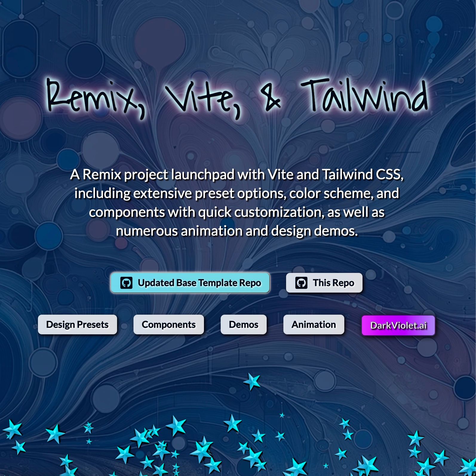
Remix Vite Tailwind Deployed Application
Remix-Vite-Tailwind repository
- remix-vite-tailwind-minimal-template: A minimal version of the more extensive repo, containing only the most essential building block components. This streamlined template serves as an efficient launchpad for new projects, embodying the core principles of component-driven design without the additional complexity of advanced features.
Remix-Vite-Tailwind-Minimal-Template repository
The Remix-Vite-Tailwind repo is updated with new animations and components intermittently, showcasing the evolving possibilities of component-driven development. The Minimal Template repo is updated very regularly and kept pristine as a launchpad for projects, incorporating the latest features and best practices in web development. This ongoing maintenance ensures that developers always have access to cutting-edge tools and techniques for component-driven design.
Key Features of the extensive Remix-Vite-Tailwind Repo:
- Remix with Flat Routes: Utilizing the full power of Remix, enhanced with a flat route structure for simplified routing. This approach streamlines navigation and improves the overall structure of your application, making it easier to manage as it grows in complexity.
- Vite Integration: Fast development and build times with Vite, configured to work seamlessly with Remix and Tailwind CSS. This integration showcases how modern build tools can enhance the component-driven development process, allowing for rapid iterations and efficient development workflows.
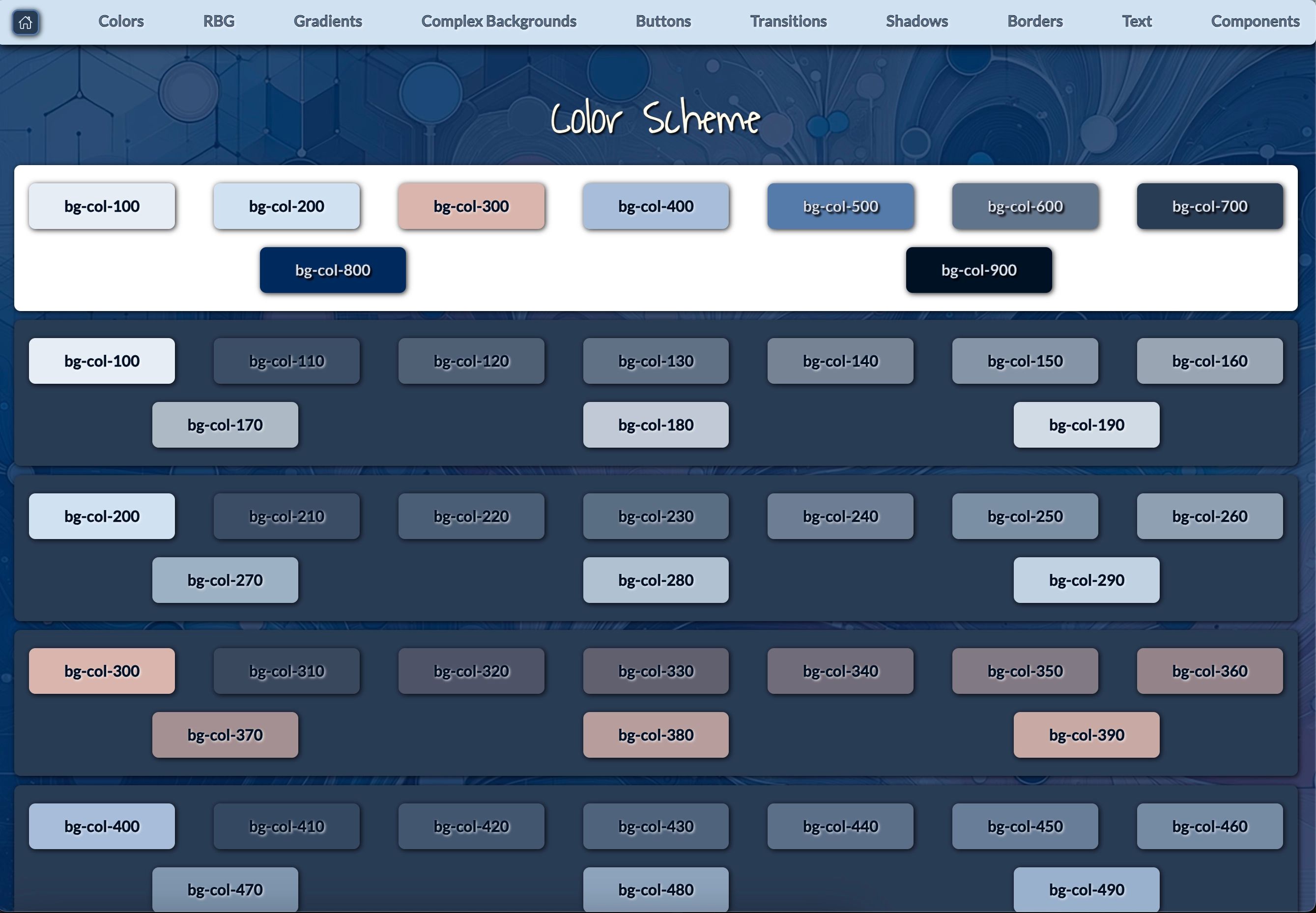
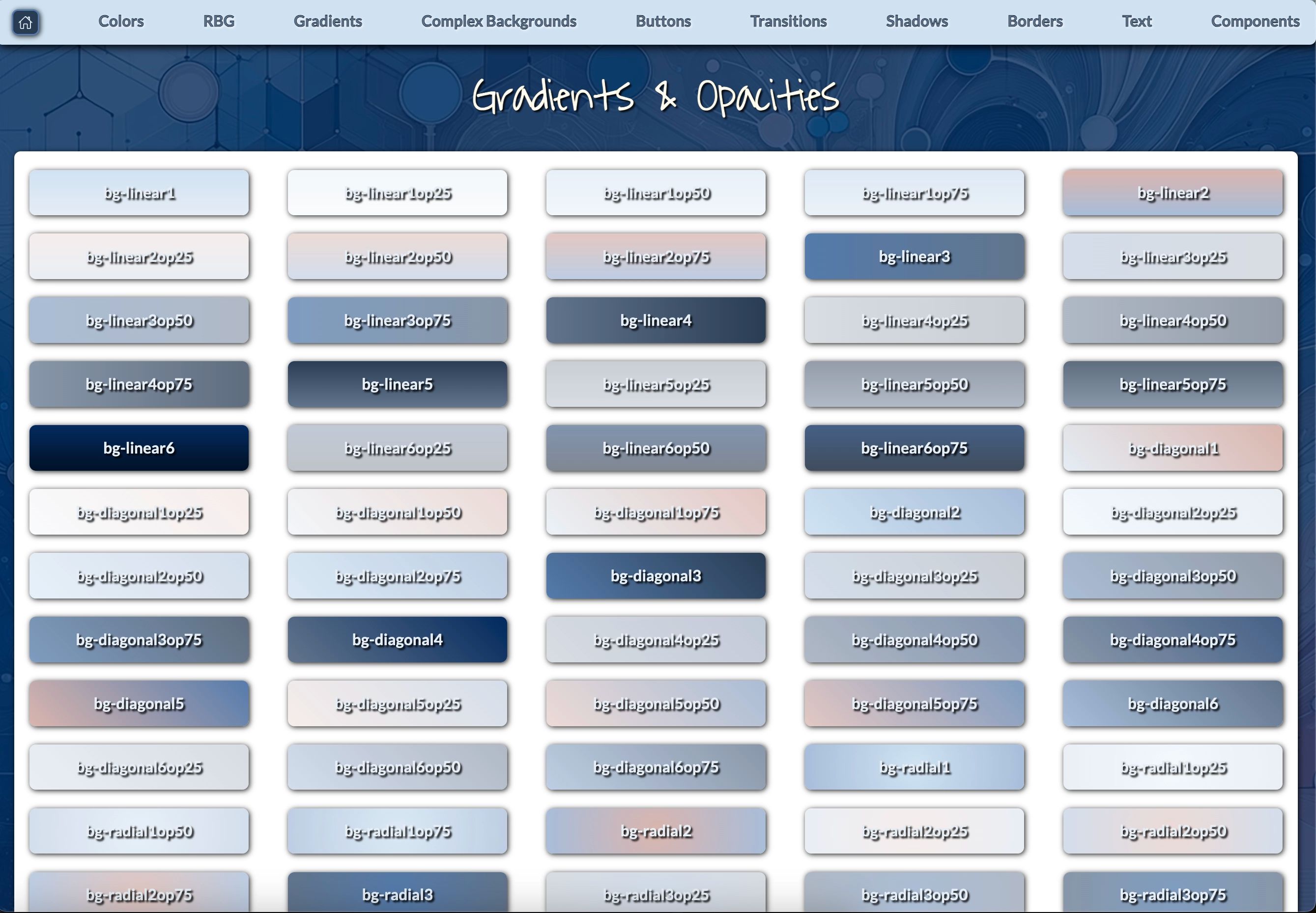
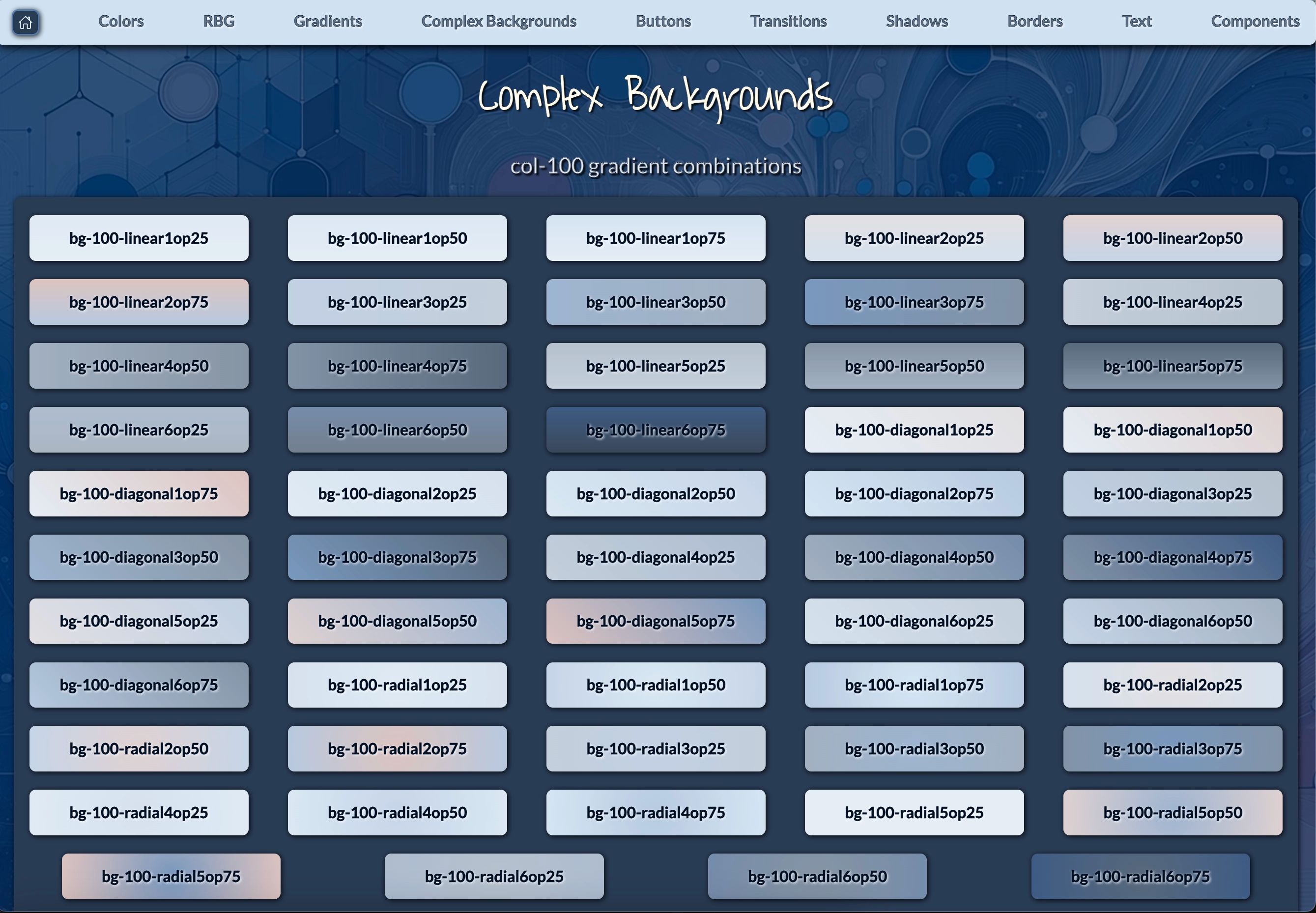
- Enhanced Tailwind Configuration: An advanced Tailwind setup that provides an extensive palette of color and background combinations. This feature demonstrates how component-driven design can be complemented by utility-first CSS frameworks, allowing for highly customizable and consistent styling across components.
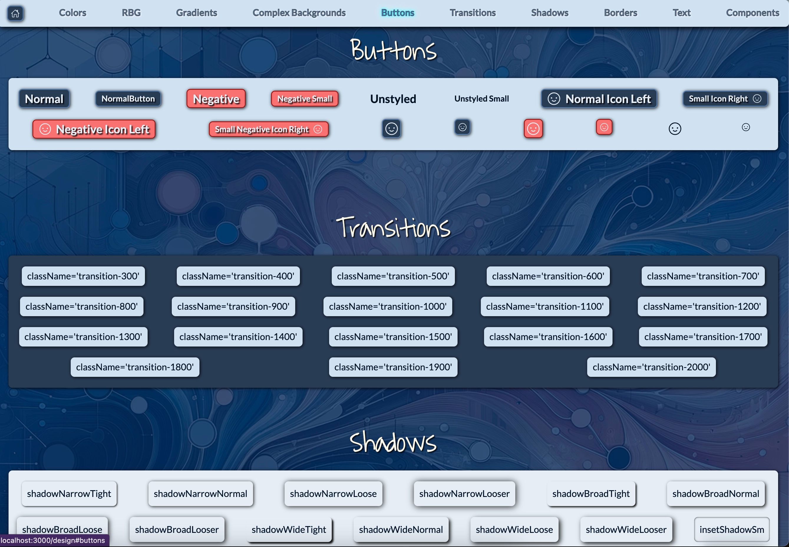
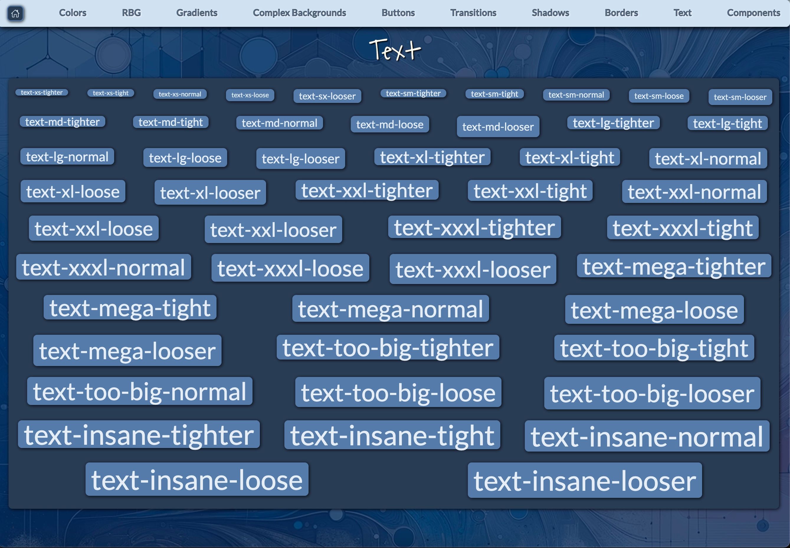
- Streamlined Design Utilities: A wealth of design utilities for shadows, text shadows, text sizes, and more. These utilities exemplify how component-driven development can be enhanced with a robust set of design tools, enabling developers to create visually appealing and consistent interfaces efficiently.
- Extensive Component Library: A vast array of components inspired by Chakra UI but extending further with more options. This library serves as a practical example of how component-driven development can lead to a rich ecosystem of reusable UI elements, accelerating development and ensuring consistency across projects.
- Easy Color Scheme Customization: Simple adjustments to the Tailwind config allow for complete color scheme changes. This feature highlights the flexibility of component-driven design, showing how entire application themes can be adjusted by modifying a centralized configuration.
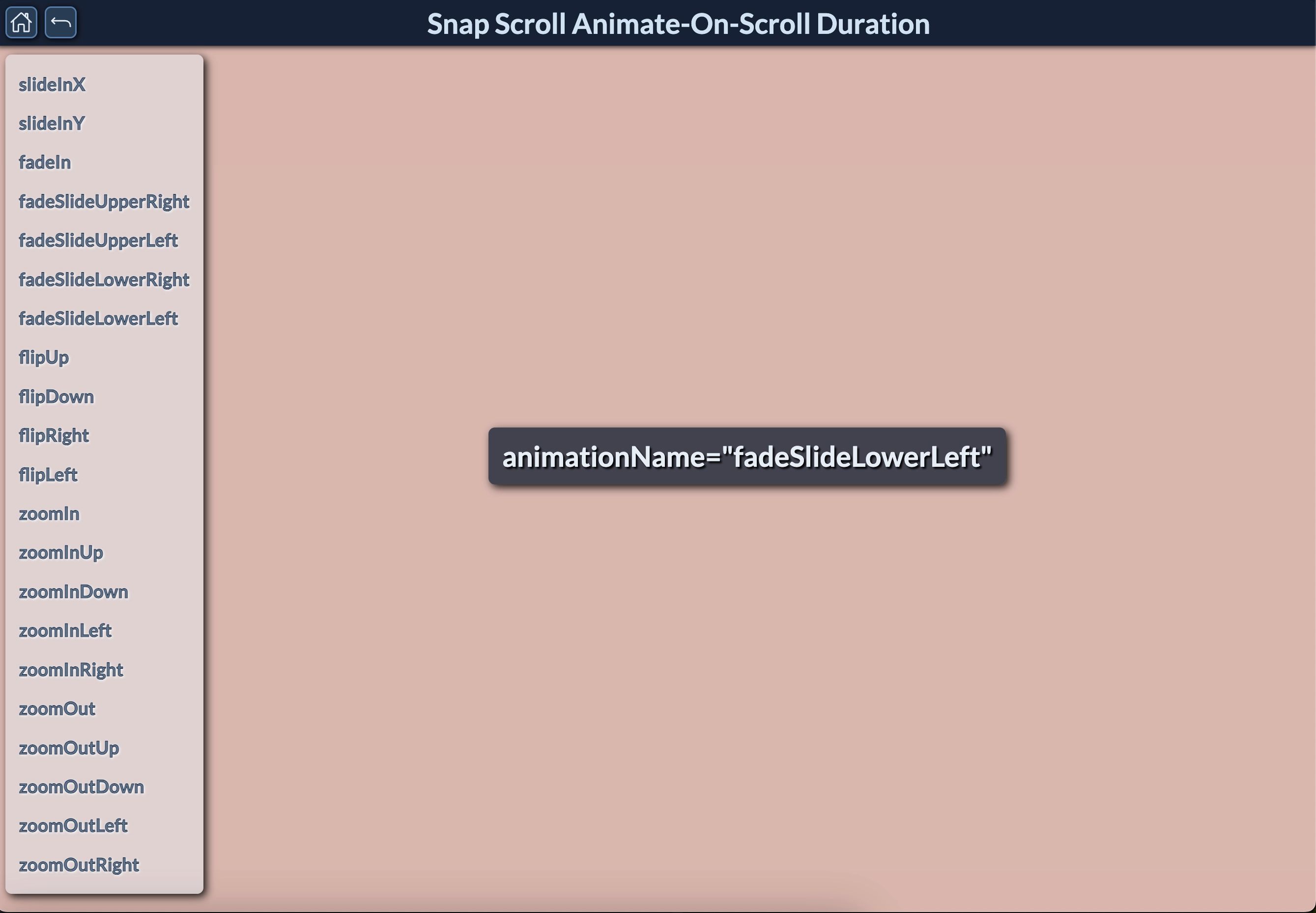
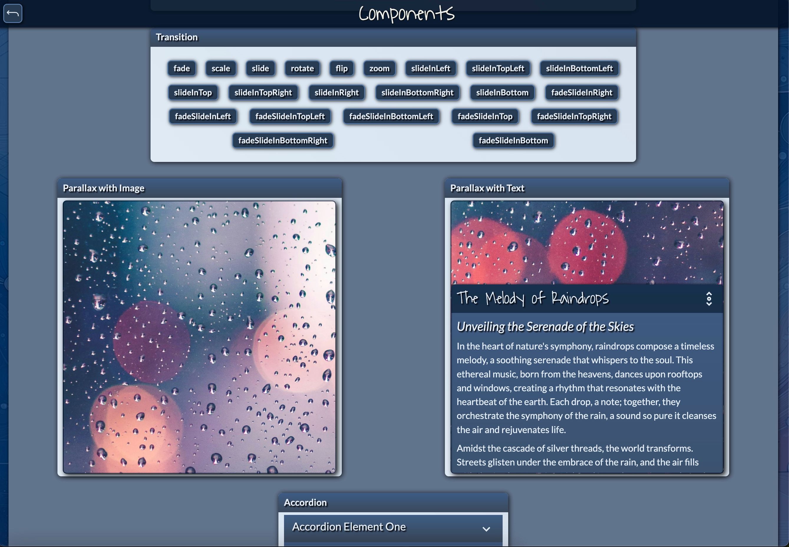
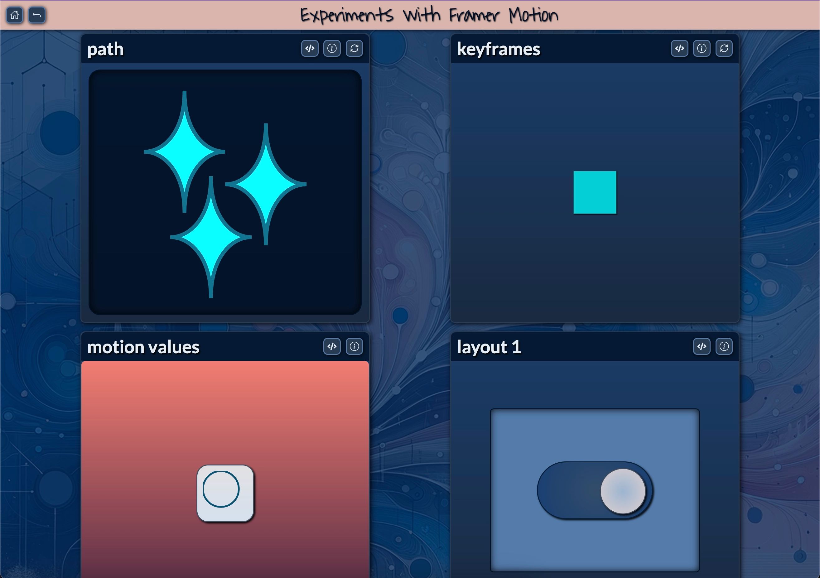
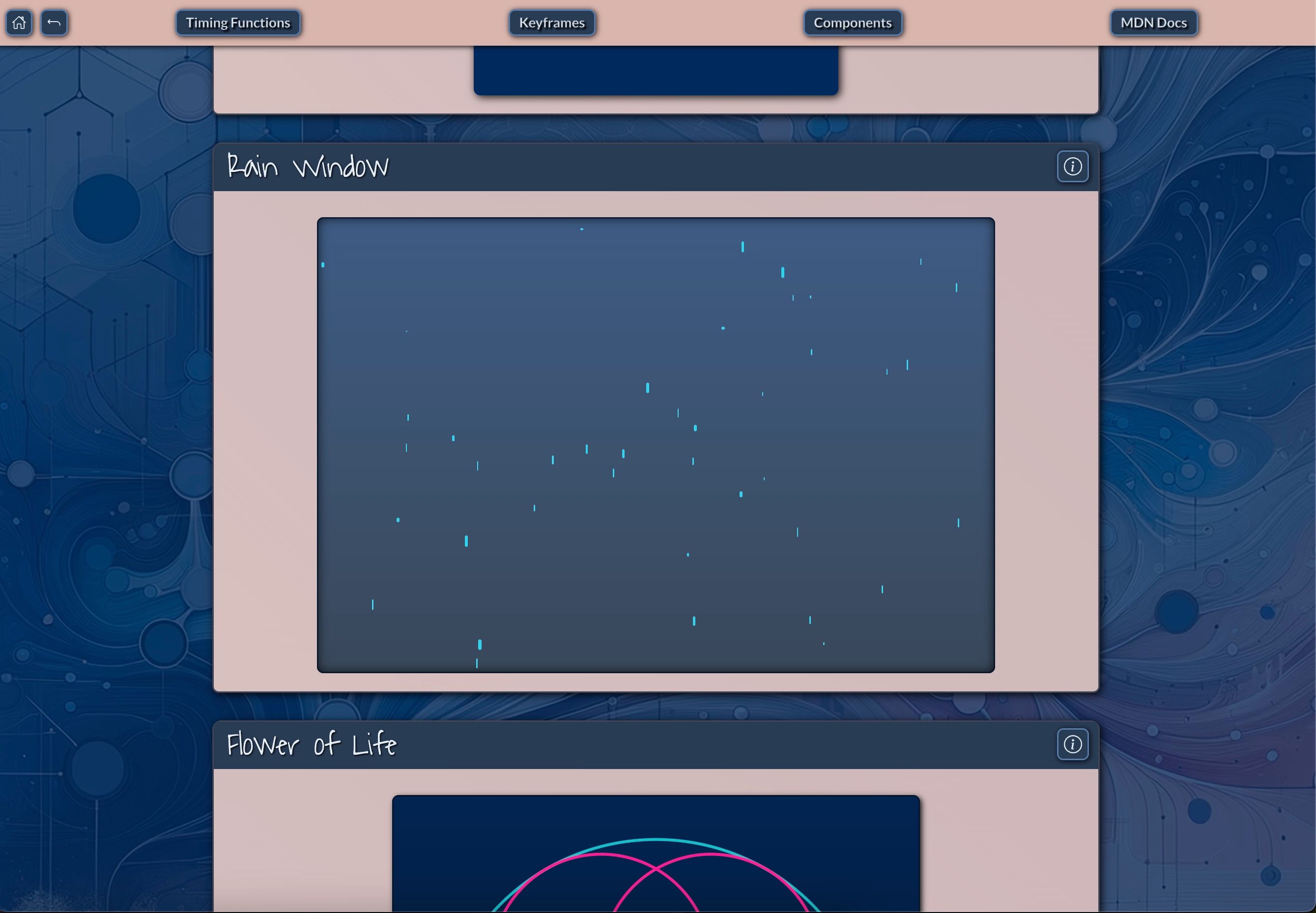
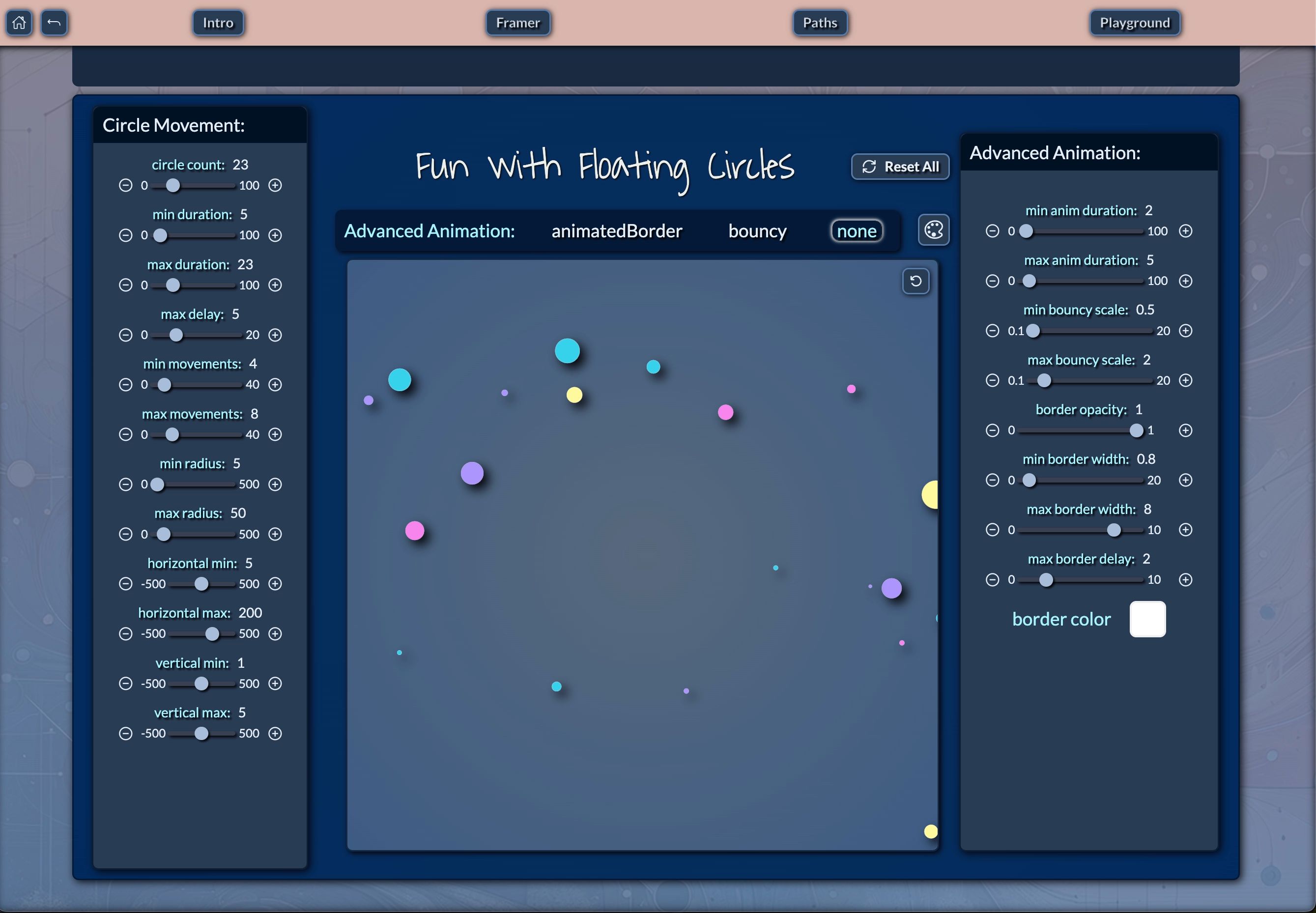
- Advanced Animation Demos: Showcases various animation techniques and interactive features. These demos illustrate how component-driven development can incorporate complex behaviors and interactions, creating engaging user experiences without sacrificing modularity or maintainability.
Key Features of the Minimal Remix-Vite-Tailwind-Minimal-Template:
- Minimal Template (remix-vite-tailwind-minimal-template): Core Remix and Vite Setup: The essential configuration for a Remix project with Vite, providing a lean starting point for component-driven projects.
- Tailwind CSS Integration: Basic Tailwind CSS setup for efficient styling, demonstrating how utility-first CSS complements component-driven development.
- Essential Building Block Components: A curated selection of the most crucial components to kickstart your project, embodying the core principles of component-driven design in a streamlined package.
- Lightweight and Fast: Optimized for quick project initialization and rapid development, showcasing how component-driven approaches can lead to efficient development processes.
- Easy to Extend: A solid foundation that you can build upon as your project grows, illustrating the scalability inherent in component-driven architectures.
Why Remix?
Remix is a full-stack framework that brings the focus back to the server, aligning perfectly with the principles of component-driven development. It enables fast, resilient web applications by handling server-side rendering (SSR), modern data-fetching techniques, and powerful routing all in one package. With Remix, pages are generated on the fly, and developers can enjoy fine-grained control over what data gets sent from the server to the client.
In the context of component-driven development, Remix offers several key advantages:
Nested Routing: Remix's nested routing system naturally complements the component-driven approach, allowing developers to create layouts and sub-layouts as reusable components.
Data Loading: The framework's data loading capabilities allow components to define their own data requirements, enhancing modularity and reusability.
Progressive Enhancement: Remix's focus on progressive enhancement ensures that components can function even without JavaScript, improving accessibility and performance.
Error Boundaries: The built-in error handling aligns well with component-driven design, allowing developers to create robust, self-contained components that can handle their own error states.
Why Vite?
Vite, known for its blazing-fast bundling, significantly speeds up the development experience. Vite's approach to bundling is different from traditional bundlers, as it takes advantage of native ES modules in modern browsers to serve only the necessary code during development, which results in nearly instant build times. For production, Vite efficiently bundles everything together.
In the realm of component-driven development, Vite offers several benefits:
Fast Hot Module Replacement (HMR): Vite's HMR is incredibly fast, allowing developers to see changes to their components almost instantly. This rapid feedback loop is crucial in component-driven development, enabling quick iterations and fine-tuning of individual components.
Pre-bundling of dependencies: Vite pre-bundles dependencies using esbuild, which is significantly faster than traditional JavaScript-based bundlers. This speed boost is particularly beneficial when working with large component libraries.
Optimized builds: For production, Vite uses Rollup, which is excellent at code-splitting and creating optimized bundles. This ensures that your component-driven application remains performant when deployed.
CSS handling: Vite has built-in support for CSS preprocessing and CSS modules, which aligns well with the modular nature of component-driven development, allowing for scoped styles within components.
Why Tailwind CSS?
Tailwind CSS brings a utility-first approach to styling, which complements component-driven development exceptionally well. Instead of writing traditional CSS rules for every element, developers can rapidly build interfaces using pre-defined utility classes directly in the markup. This leads to a faster development workflow without sacrificing flexibility.
The synergy between Tailwind CSS and component-driven development is particularly powerful:
Consistency: Tailwind's predefined classes ensure consistency across your components, making it easier to maintain a cohesive design system.
Flexibility: The utility-first approach allows for quick customization of components without the need to write custom CSS for each variation.
Performance: By using utility classes, you're essentially creating critical CSS for each component, which can lead to smaller stylesheet sizes and better performance.
Readability: When combined with component-driven development, Tailwind classes make it easy to understand the styling of a component at a glance, right in the markup.
Responsive design: Tailwind's responsive utility classes make it simple to create components that adapt to different screen sizes, a crucial feature in modern web development.
Template Overview (continued)
- app/: The heart of the Remix application. This directory contains the main routing and layout components, showcasing how component-driven development can be applied to application structure.
- components/: Contains reusable UI components. This directory is a testament to the power of component-driven development, housing a collection of modular, self-contained UI elements that can be composed to create complex interfaces.
- buildingBlocks/: Custom design elements such as modals, buttons, accordions. These building blocks demonstrate how atomic design principles can be applied in component-driven development, creating a library of versatile UI components.
- styles.tsx: Global styles file, including the customizable themeColors. This file showcases how global styling can be managed in a component-driven architecture, ensuring consistency across the entire application.
The minimal template includes only the essential components and configurations, making it ideal for developers who want a clean slate to build upon. It serves as a starting point for those who wish to embrace component-driven development without the overhead of a full-featured template.
Both templates adhere to component-driven development principles by:
Separating concerns: Each component is responsible for its own logic and presentation.
Promoting reusability: Components are designed to be used in multiple contexts throughout the application.
Enhancing maintainability: By breaking the UI into smaller, manageable pieces, the templates make it easier to update and maintain the codebase.
Facilitating scalability: As your project grows, you can easily add new components or modify existing ones without affecting the entire application.
Modular Components: Building Blocks for Your Application
Both templates offer a rich set of modular components that serve as building blocks for your application. These components are designed to be highly customizable and reusable, allowing you to quickly assemble complex user interfaces. They embody the core principles of component-driven development, providing a practical demonstration of how this approach can streamline the development process.
Examples of some key components available in both the full and minimal templates include:
Accordion: A collapsible container for organizing and presenting large amounts of content in a compact, expandable format. This component showcases how complex UI behaviors can be encapsulated within a reusable module, adhering to the principles of component-driven development.
Modal: A versatile pop-up dialog component for displaying additional content or capturing user input without navigating away from the current page. The Modal component demonstrates how component-driven development can handle complex UI interactions in a modular and reusable manner.
Button: A highly customizable button component with various styles, sizes, and states to fit different UI needs. This component illustrates how even simple UI elements can benefit from the component-driven approach, allowing for consistent styling and behavior across the application.
Input: A flexible input component supporting various types (text, number, email, etc.) with built-in validation options. This component showcases how form elements can be standardized and reused across an application, improving consistency and reducing development time.
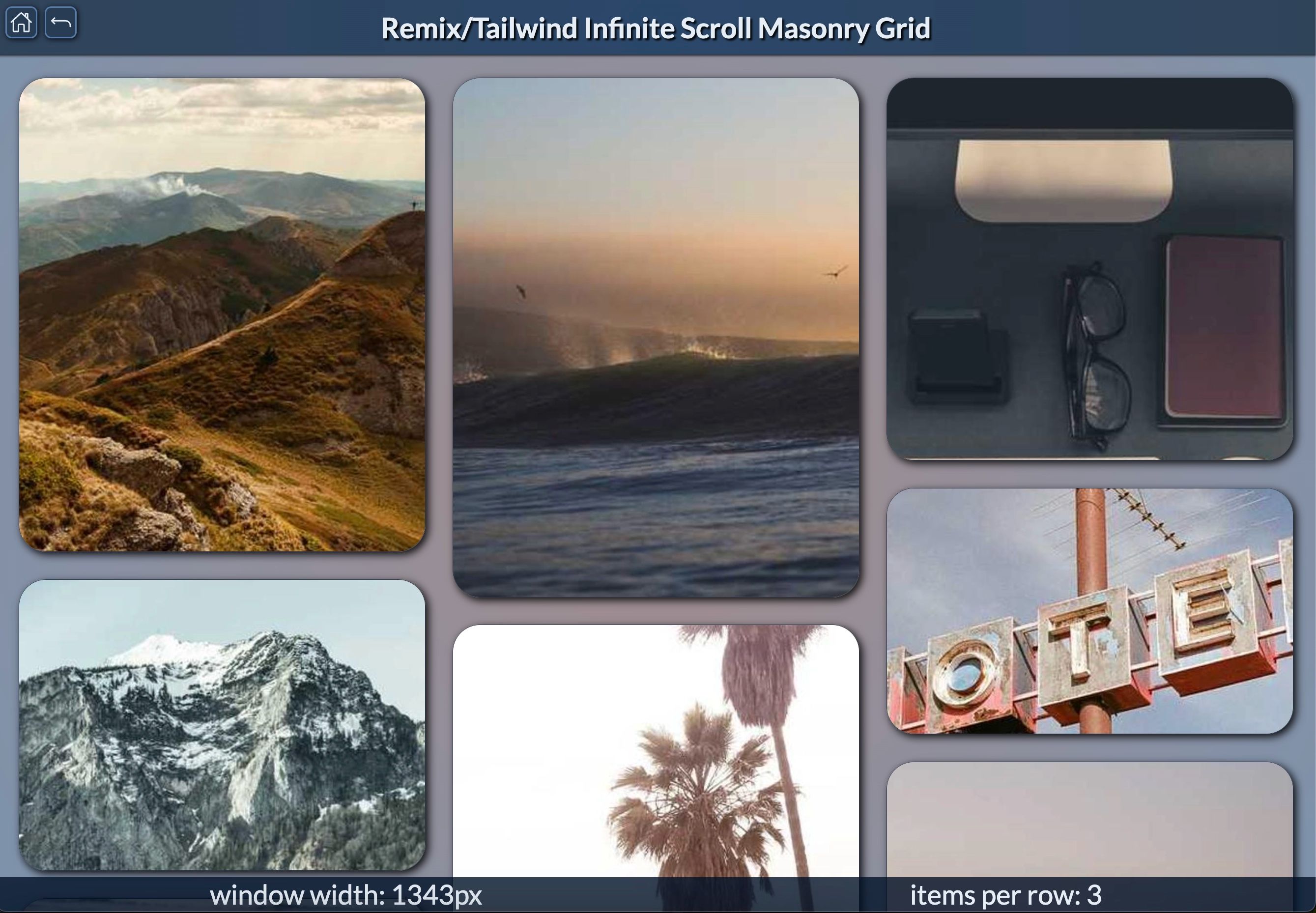
Flex and Grid Containers: Responsive layout components (Flex, FlexFull, HStack, VStack, etc.) for easy arrangement of content and other components. These layout components demonstrate how component-driven development can simplify responsive design, allowing developers to create complex layouts using composable building blocks.
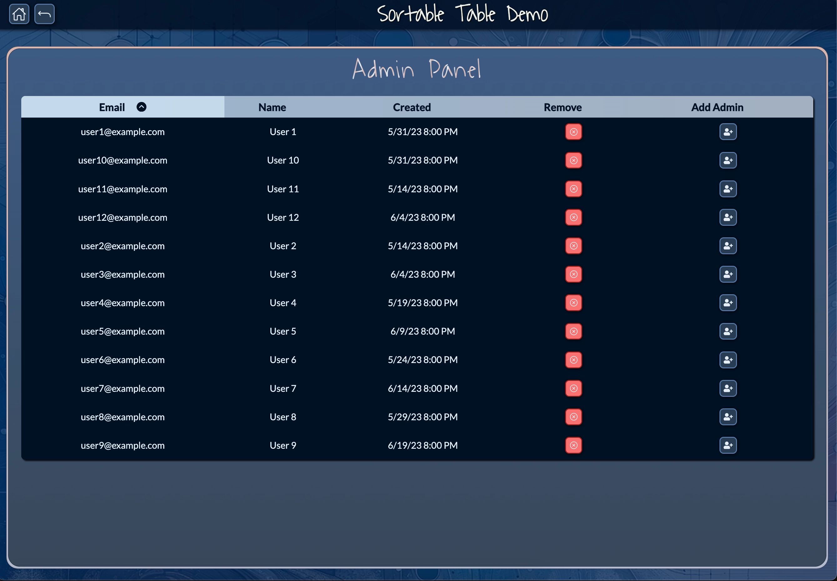
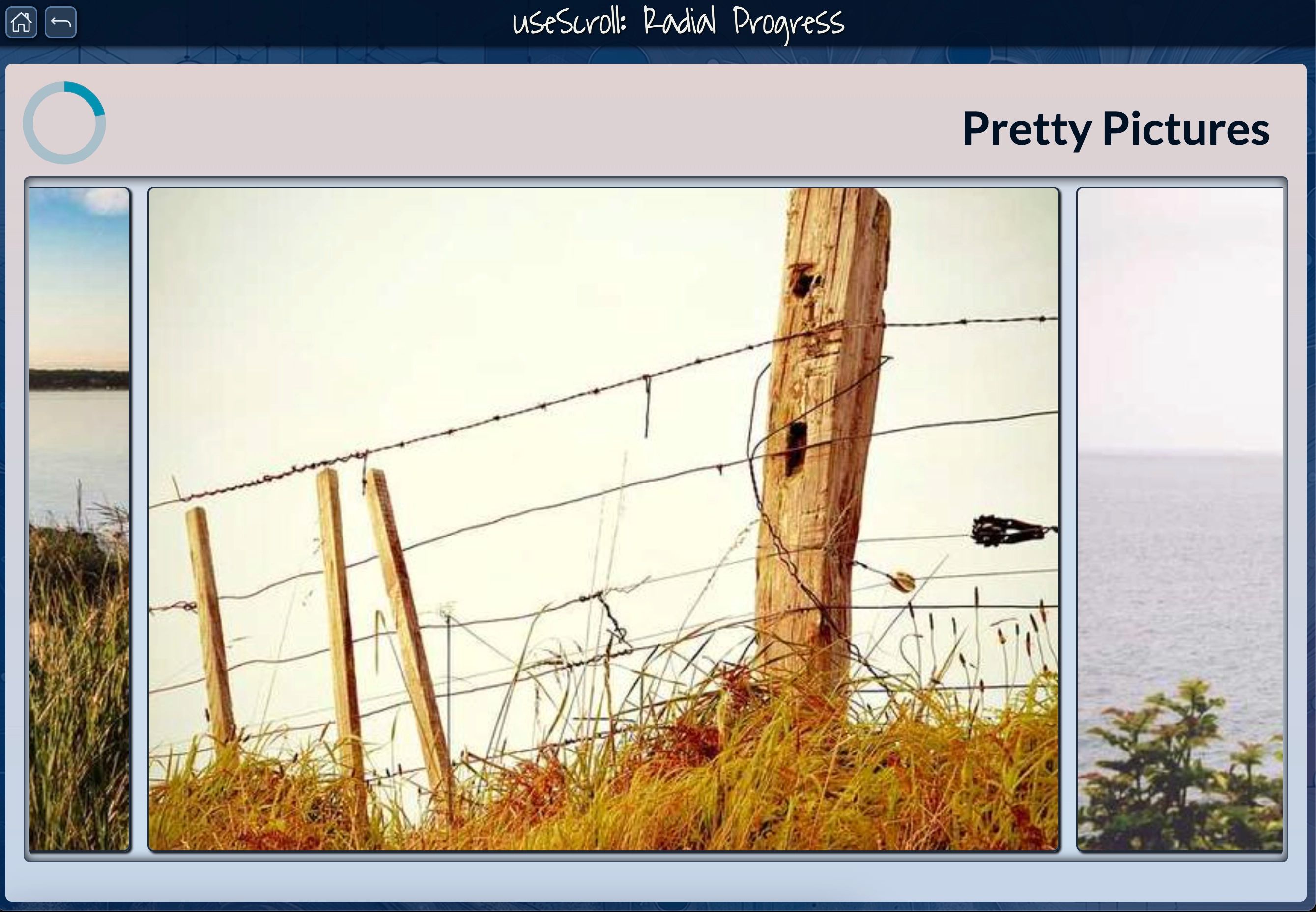
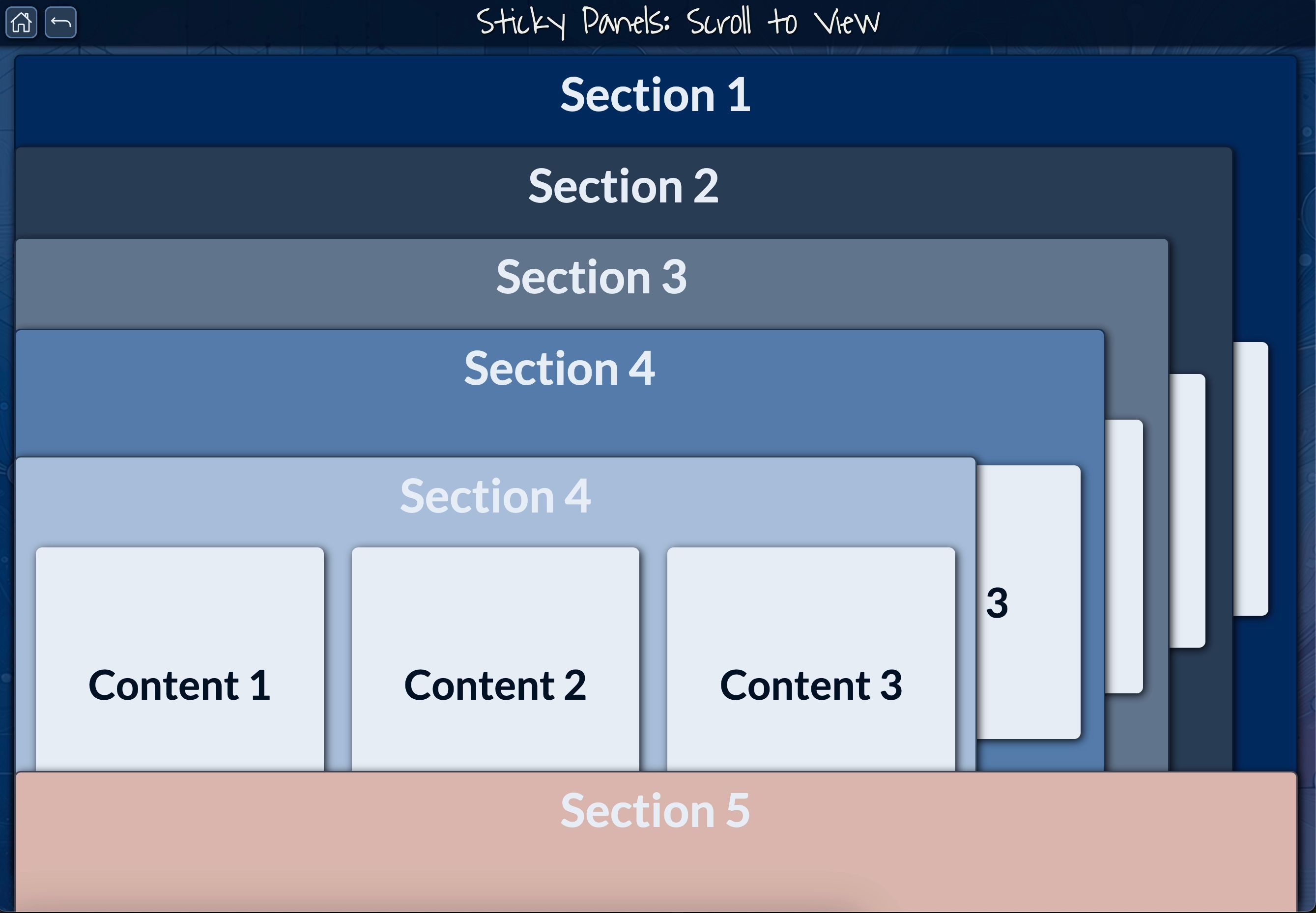
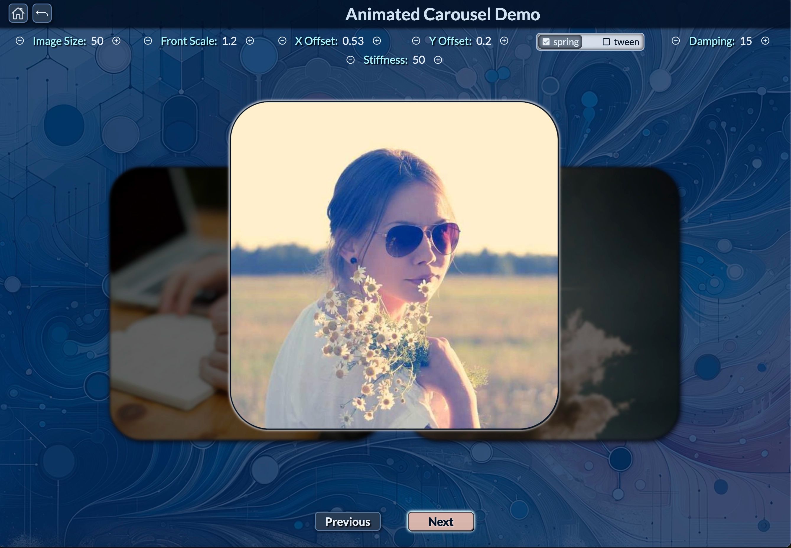
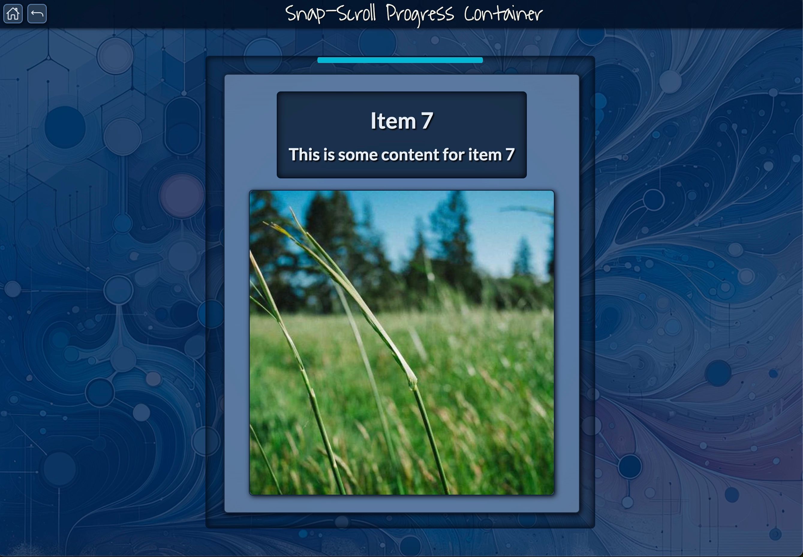
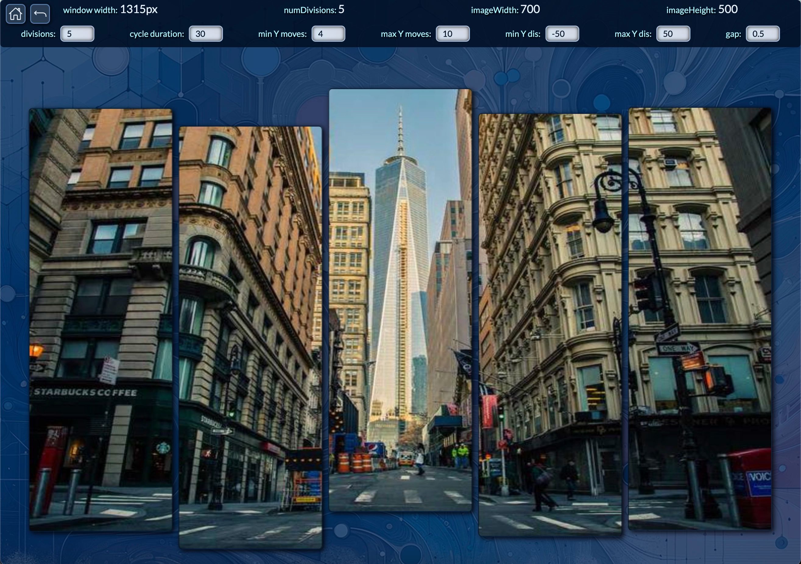
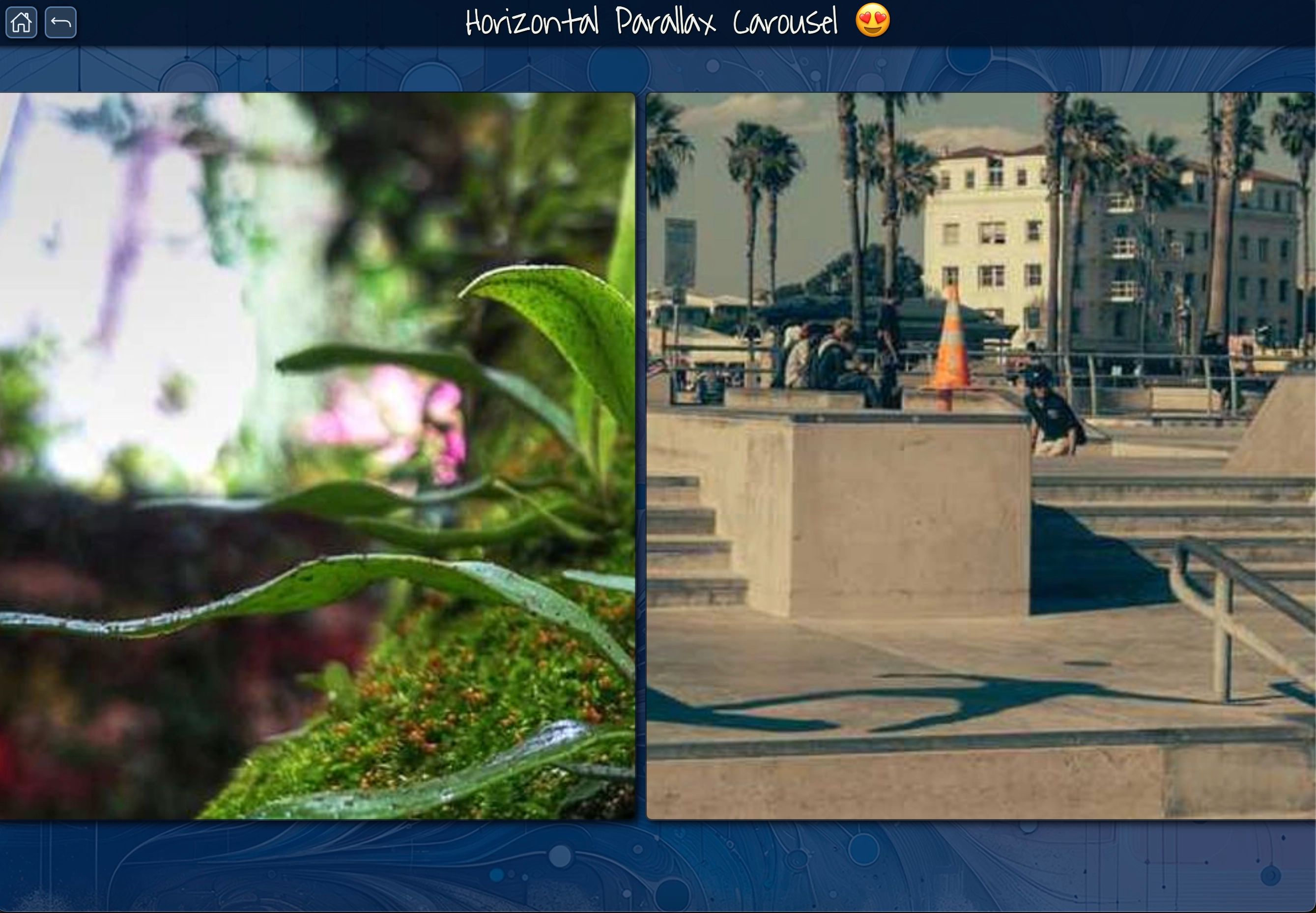
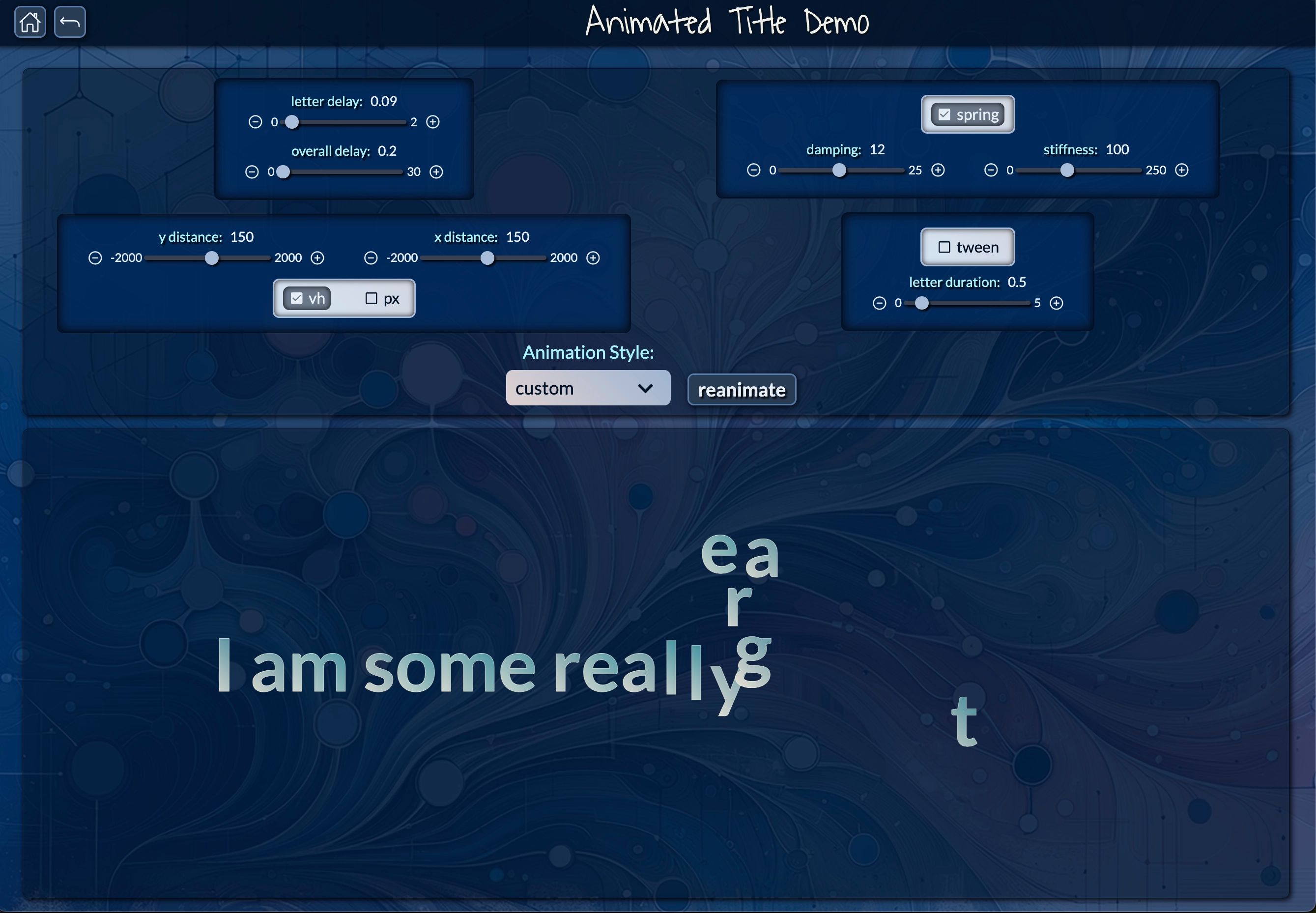
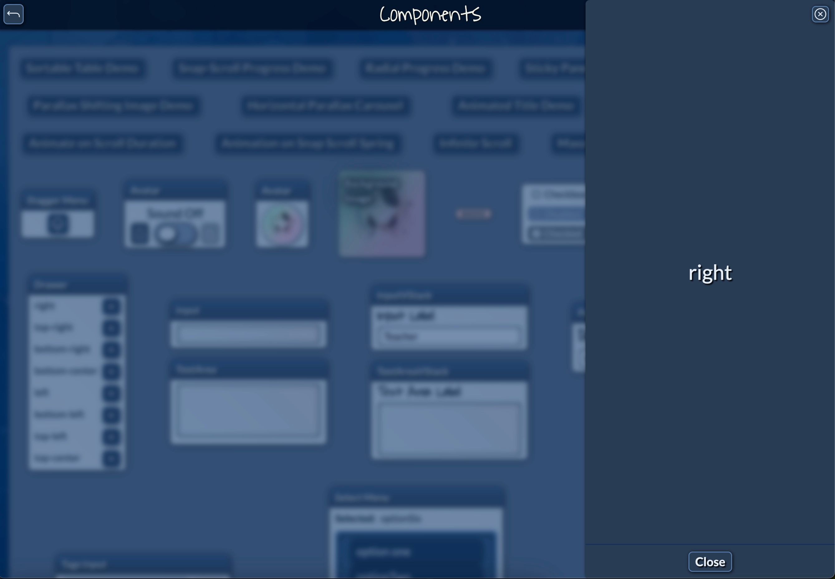
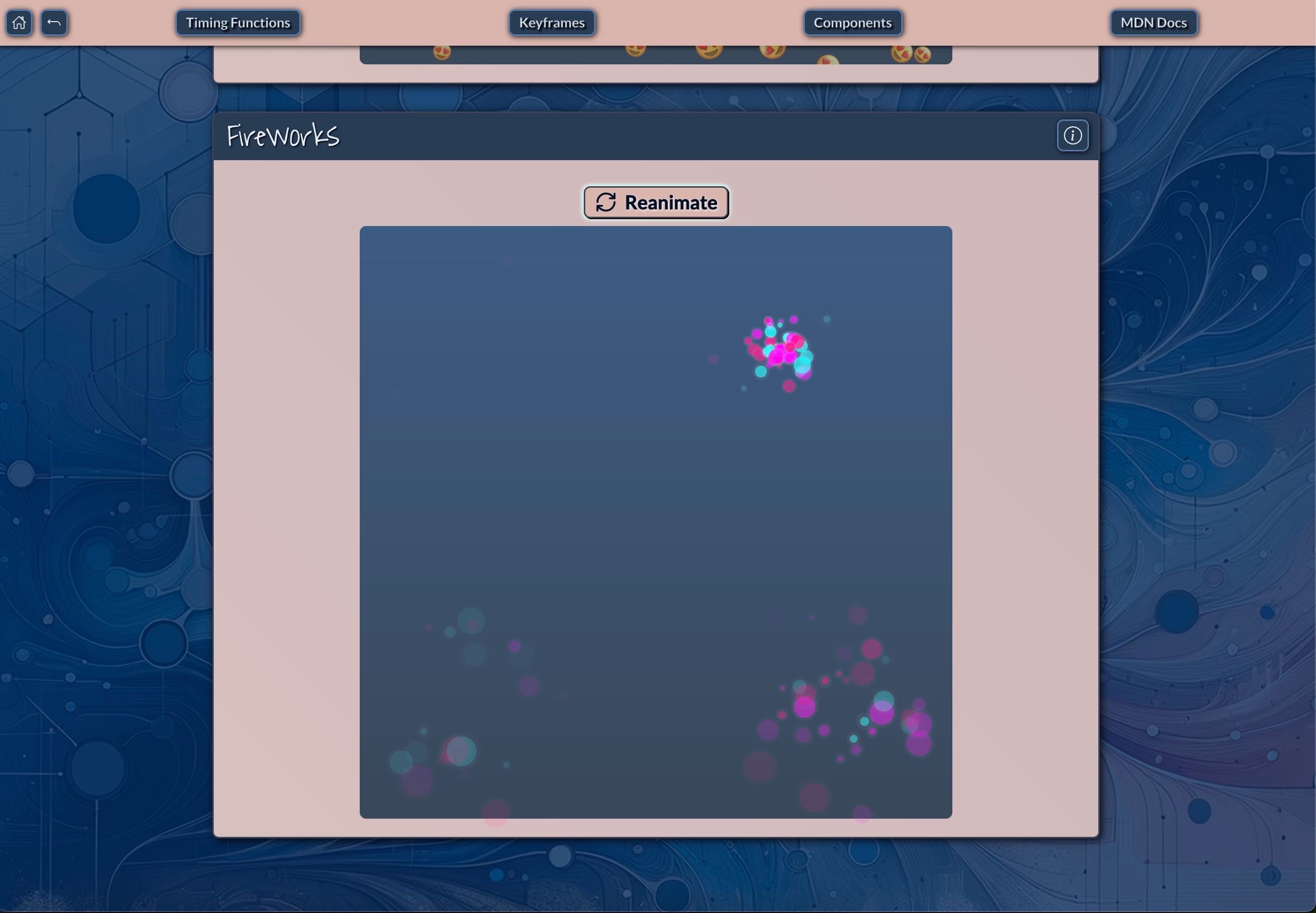
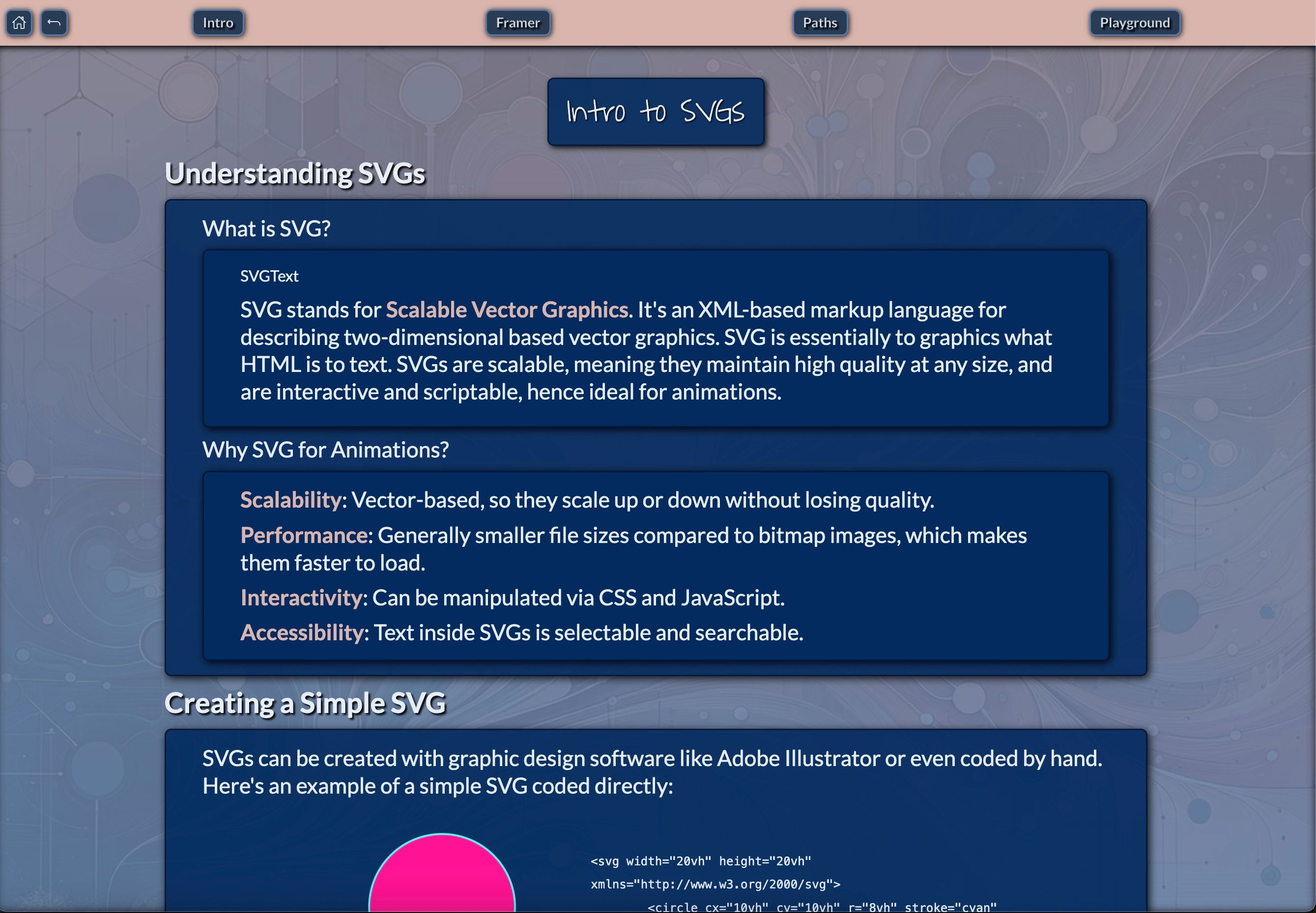
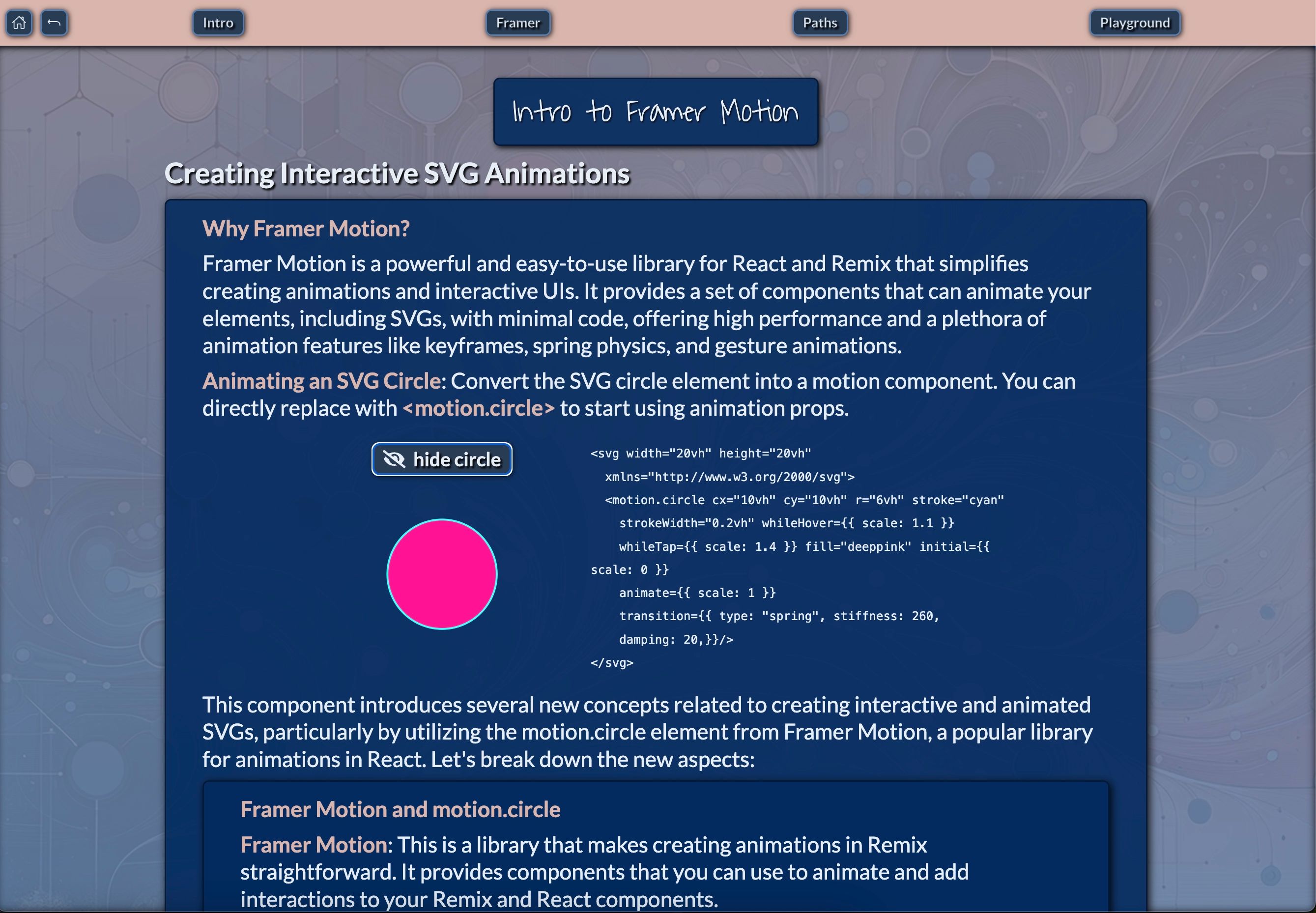
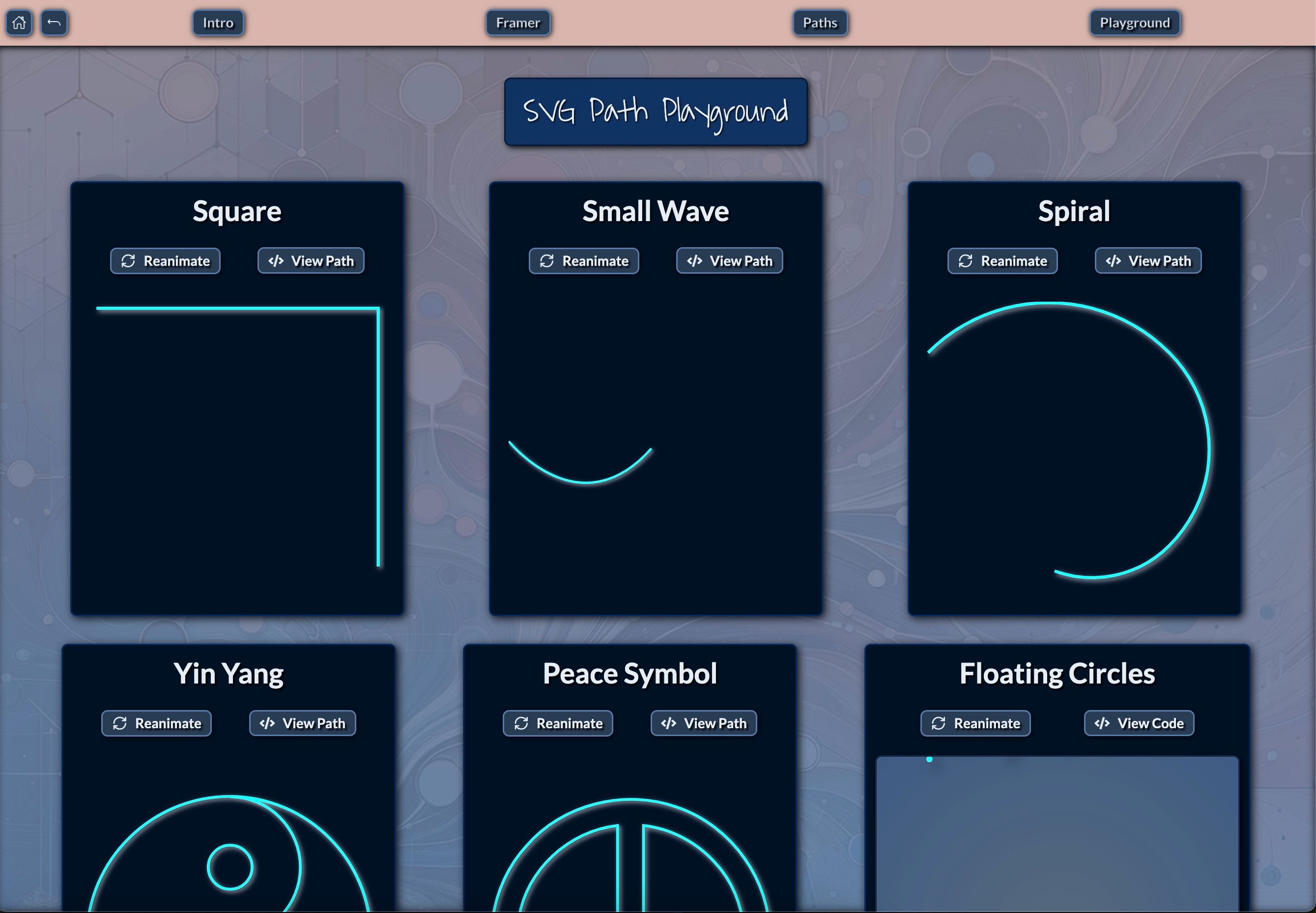
Have a look at the gallery carousel below to see some of the components in action, and click on the links accompanying each image to experience them firsthand on the deployment site as you scroll through the images.
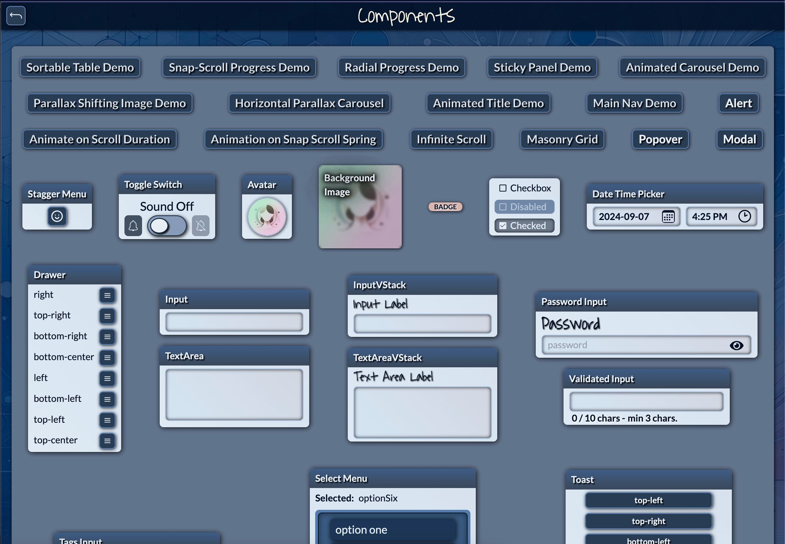
These components form the foundation of your UI, allowing you to rapidly prototype and build your application. Each component is designed with customization in mind, offering props to adjust appearance and behavior to match your specific needs. This approach embodies the flexibility and reusability that are hallmarks of component-driven development.
For example, the Accordion component allows you to create expandable sections of content, perfect for FAQs or detailed product information. Its modular nature means you can easily reuse it across different parts of your application, maintaining consistency while adapting to various content needs.
The Modal component can be used for everything from simple alerts to complex forms, enhancing user interaction without cluttering the main interface. Its versatility showcases how a well-designed component can serve multiple purposes within an application, reducing the need for redundant code.
By utilizing these pre-built components, you can significantly speed up your development process while maintaining a consistent look and feel across your application. This consistency is a key benefit of component-driven development, as it improves user experience and reduces cognitive load for both users and developers.
The minimal template includes these essential components, providing a clean starting point for those who prefer to build up their component library gradually. On the other hand, the full template offers an even more extensive library of components and features for more complex applications, demonstrating how component-driven development can scale to meet the needs of larger projects.
Remember, all these components are built with Tailwind CSS, meaning you can easily customize their appearance using Tailwind's utility classes or extend them with your own styles. This integration of Tailwind with component-driven development offers a powerful combination of flexibility and consistency, allowing you to create unique designs while maintaining a structured approach to your UI development.
Enhancing Code Readability with Descriptive Component Names
One of the standout features of this template is the use of highly descriptive names for its building block components. This naming convention goes beyond mere organization – it transforms your code into a visual blueprint of your user interface. This approach is a key aspect of component-driven development, as it enhances code readability and maintainability. Let's explore how this approach benefits developers:
Intuitive Understanding: Components like HStack, VStack, Flex, and FlexFull immediately convey their layout purpose. When you see HStack in your code, you can instantly visualize a horizontal arrangement of elements. This intuitive naming is crucial in component-driven development, as it allows developers to quickly grasp the structure and purpose of each component without needing to dive into its implementation details.
Rapid Prototyping: With components named after their function (e.g., Modal, Accordion, ExpandableImage), you can quickly assemble complex UI structures. This speeds up the prototyping process and allows for faster iterations. In the context of component-driven development, this means you can quickly compose new features or pages using existing, well-named components, significantly reducing development time.
Improved Collaboration: Descriptive names make it easier for team members to understand each other's code. A new developer joining the project can quickly grasp the structure of a page just by reading the component names. This is particularly valuable in component-driven development, where multiple team members might be working on different components simultaneously.
Mental Mapping: As you write your JSX, you're essentially creating a mental map of your UI. Components like CenterFull or WrapFull allow you to envision the layout without needing to run the application constantly. This mental mapping is a significant advantage of component-driven development, as it allows developers to reason about the UI structure at a higher level of abstraction.
Consider this example of how the code structure mirrors the visual layout:
<VStack>
  <Header />
  <HStack>
    <Sidebar />
    <VStack>
      <ContentArea />
      <ExpandableImage />
    </VStack>
  </HStack>
  <Footer />
</VStack>
This code snippet demonstrates how descriptive component names can create a clear, almost visual representation of the page structure. Even without seeing the rendered output, a developer can understand the layout: a vertical stack containing a header, a horizontal section with a sidebar and main content area (which includes an expandable image), and a footer.
This approach to naming and structuring components offers several benefits in the context of component-driven development:
Self-documenting code: The code itself becomes a form of documentation, reducing the need for extensive comments or separate documentation to understand the UI structure.
Easier refactoring: When components are clearly named and structured, it's easier to identify where changes need to be made when refactoring or updating the UI.
Improved consistency: Descriptive names encourage developers to use existing components rather than creating new ones for similar purposes, promoting consistency across the application.
Faster onboarding: New team members can quickly understand the application structure and start contributing, even if they're not familiar with the specifics of each component's implementation.
Enhanced communication: Descriptive component names provide a common language for designers and developers to discuss UI elements, bridging the gap between design and implementation.
By embracing this naming convention and structural approach, the templates not only demonstrate best practices in component-driven development but also set the foundation for more maintainable, scalable, and collaborative projects.
Conclusion
As we've explored, modular component-driven design offers significant benefits for modern web development, including improved scalability, maintainability, and collaboration. The Remix-Vite-Tailwind templates we've discussed are practical implementations of these principles, offering powerful foundations for building scalable web applications.
I encourage you to explore both the remix-vite-tailwind and remix-vite-tailwind-minimal-template repositories. Experiment with the components and features, and experience firsthand how a modular, component-driven approach can streamline your development process and improve your final product.
As we continue to push the boundaries of web development, the principles of component-driven design will play a crucial role in shaping the future of our digital experiences. Whether you're building a small personal project or a large-scale enterprise application, this approach provides the tools and flexibility needed to bring your vision to life efficiently and maintainably.
Remember, the journey of a thousand miles begins with a single step – or in our case, a single component. Embrace the power of component-driven development, and watch as your projects become more manageable, scalable, and successful. Happy coding!
References
- Component-driven development: Best practices to build scalable ...
- What are some advantages of Component Driven Development
- A Guide to Component Driven Development (CDD) - ITNEXT
- 6 Advantages of Component-Based Development - DZone
- Why More Businesses are Using Modular Website Development
- What is a Component Library, and Why Should You Use One for UI ...
- The Advantages of Modular Web Design for Small Businesses
- Modular Web Design: The Best Way to Build Scalable Websites
- What makes a great component library | Retool Blog
- Top 7 Advantages of Component-Based Design Systems
- What is Component Driven Development? (In a Nutshell) - Drewl