Explore the tools, techniques, and inspirations behind the design and functionality of the mockup, highlighting my journey from concept to execution.
A Deep Dive into My Design and Development Process
In keeping with my standard toolkit, I chose Remix for its exceptional efficiency and flexibility in managing React components, which aligns perfectly with my workflow. Tailwind CSS, another staple in my projects, was my go-to for styling, thanks to its utility-first approach that accelerates development and simplifies responsive design adjustments. Together, these tools form the backbone of my web development process, enabling me to create clean, modern, and responsive designs efficiently.
I'll never forget the first time I encountered a Tesla. It was back in 2013 at an art museum in Houston. The sight was so striking that I couldn't help but LITERALLY shout, 'What is that!?' Beyond its aesthetic appeal, my fascination was deepened by my admiration for Nikola Tesla—his innovations alongside those of Alan Turing, Richard Feynman, and Hayao Miyazaki have always inspired me profoundly. They are my absolute heroes. So when I heard about the Tesla automobile, I was a bit in love, to be honest. I am a girl who can appreciate the beauty in science and technology.
When I first visited the Tesla website, I was equally impressed. It mirrored the clean, modern, and sleek essence of their cars. Motivated by this design excellence, I decided to recreate the Tesla website as a mockup. Interestingly, I noticed the absence of the snap-scroll functionality, which I was certain had been a feature just a few months prior—perhaps a touch of the Mandela Effect? Regardless, I reinstated it in my mockup, believing it enhances the overall user experience significantly. Honestly, it is just fun.
My initial design included a parallax effect with fixed background images, aiming for a dynamic visual impact. However, I quickly discovered Safari’s reluctance to cooperate with fixed backgrounds, at least when one tries to use them as liberally as I was on this mockup. I honestly wanted to cry a little, because I knew the truth. I was going to have to let go of my fixed images. One cannot really create web content that will look like it is having a horrible seizure when opened on a Macbook. Though I opted to remove the fixed images to maintain functionality, the design still holds up well. Yet, I can't help but feel nostalgic for what might have been.
Let's look at some of the key features, shall we?
Responsive Menus
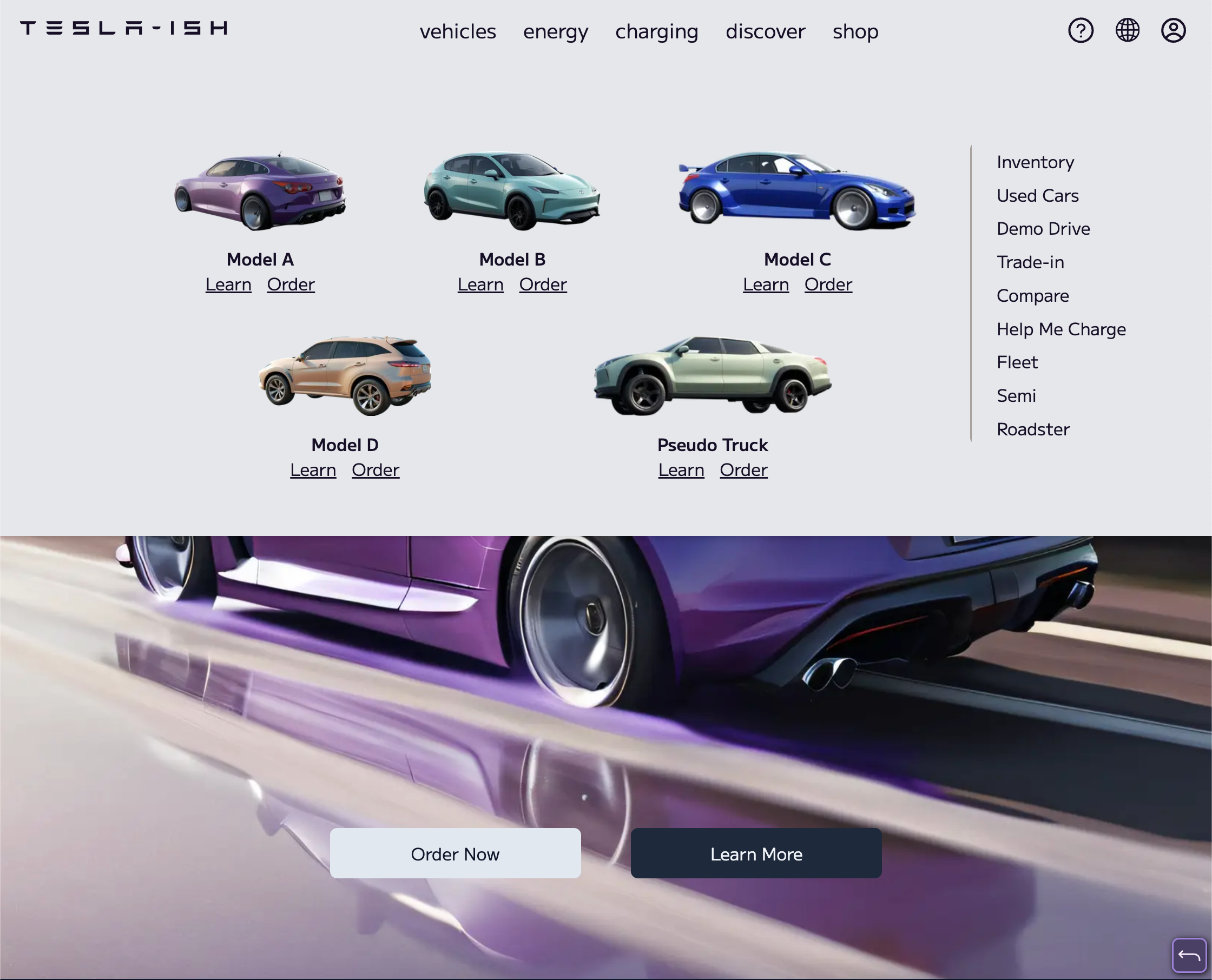
- Small and Large Screen Variants: Utilizing conditional rendering in React, I implemented two versions of the navigation menu. The TeslaSmallScreenMenu and TeslaLargeScreenMenu components adapt to different device sizes, ensuring a seamless user experience across all platforms. However, my brilliant use of flexbox and wrap meant that I only needed to create the actual content of each menu once.
- Interactive Elements: The menus incorporate motion.div from Framer Motion for smooth animations, enhancing the tactile feel of user interactions.
- An alteration: I decided not to close the menu when the mouse leaves the menu, however, as the Tesla site does. I would rather close the menu myself by clicking on the background outside the menu or hitting the escape key. Too many times I have found that on sites that incorporate this kind of interaction on the mouse exiting that the menu repeatedly closes when I do not want it to. It is a small thing, but I am picky about perfection.
Dynamic Content Rendering
- Section-wise Navigation: Each section of the website, such as the vehicle showcase or solar products, was built using individual Flex components that snap into place as the user scrolls. This snap-scroll effect was meticulously styled with Tailwind CSS for a crisp, modern look.
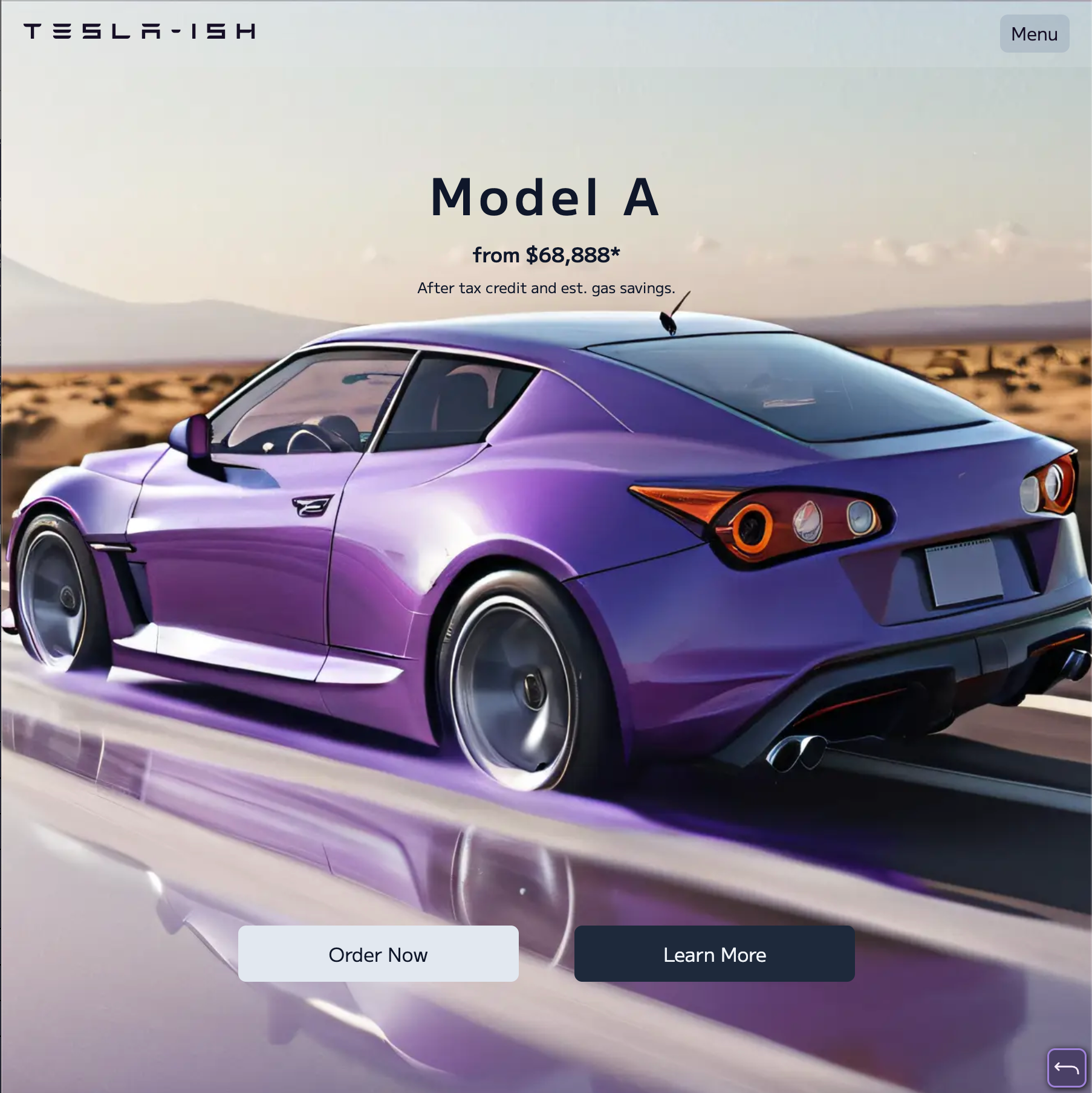
- AI-Generated Images: All vehicle and product images were generated using my custom Stable Diffusion setup, giving a unique touch to the mockup and demonstrating the integration of AI in web design. Plus, I had to make sure that I do not step on too many Tesla toes. So I used all my own graphics.
When I was putting together the Tesla mockup, I really wanted every piece to feel just right—down to the font for the logo. I hunted around until I found an incredibly accurate font, which made me VERY happy. It was much simpler than SVG shenanigans, and it was easy to import from CDN. Plus, whenever I work with SVG, I have to FIGHT myself not to animate them. It is just too much fun.
The Cybertruck font, however, was not easy. It is a pretty fancy little creation made by, from what I gathered, a guy who also designs some very cool shoes. I found him very inspiring, and if the day had about 75% more hours in it, I would definitely spend a good amount of time designing fonts too. But a girl cannot do everything, no matter how hard she tries. Sooooo, I found a nice little graffiti font for my Pseudo Truck. I think it did the trick.
And that’s the story. Working on this Tesla website mockup was a short deep dive into some really intricate web design elements. And solving the little challenges that came up along the way was a lot of fun. I hope you enjoy exploring the mockup as much as I enjoyed creating it. And if you have any questions or feedback, I’d love to hear from you. I am always up for a good chat about web design, AI, or quantum physics! Here's to Nikola! Thanks for reading! May the most beautiful hex colors shine down upon you!